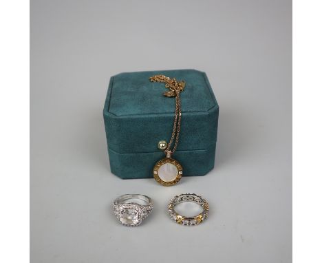
We found 3352 price guide item(s) matching your search
There are 3352 lots that match your search criteria. Subscribe now to get instant access to the full price guide service.
Click here to subscribe- List
- Grid
-
3352 item(s)/page

Lot 464
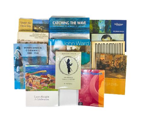
Cornish Art Interest Drawings, Verse and Belief, Bernard Leach. Published by Jupiter, 1977; Catching The Wave, Tom Cross. Halsgrove, 2002; Under The Open Sky, Catherine Wallace. reprinted 2014; Artists Of The Newlyn School, Caroline Fox & Francis Greenacre, reprinted 2014. Bridget Riley - Paintings and Drawings 1951-1971, The Hawyard Gallery. A Vital Simplicity - Four Generations of The Nicholson Family, Caroline Wiseman, 2004; Munnings at The River In His Own Words, Marcia Whiting. Barbara Hepworth, Andrew Langley, Heinemann Press. Laura Knight - A Celebration, edited by Elizabeth Knowles. Sansom & Company, 2021; Women Artists in Cornwall 1880-1940, compiled by Catherine Wallace, Falmouth Art Gallery, 1996; The Paintings of John Ward, David & Charles 2006; Singing From The Walls, The Life Of Elizabeth Forbes, Judith Cook and Melissa Hardie, Sansom & Company, 2000 (12)
Lot 6105
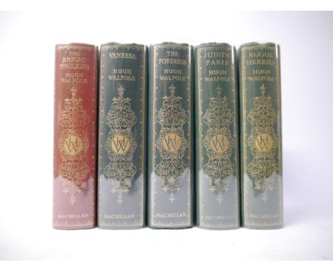
Hugh Walpole, five 1st editions, all signed & inscribed by Walpole to a W. Hector Thomson and dated in the year of publication, all published London, Macmillan, all original decorative cloth gilt in fine condition: 'Rogue Herries', 1930, original publisher's promotional booklet loosely inserted, 'Judith Paris', 1931, 'The Fortress', 1932, 'Vanessa', 1933, 'The Bright Pavilions', 1940 (5)
Lot 6188
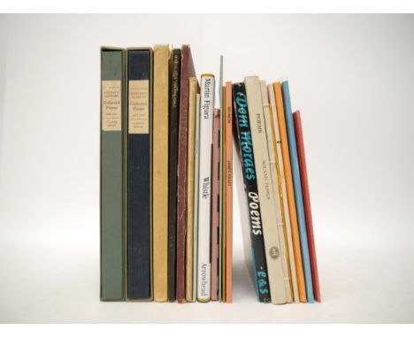
Assorted poetry, limited editions, limited editions signed etc, 19 titles, including William Russell Flint (ill.); M.R. James (Intro.): 'Judith', London, Haymarket Press, 1928, limited edition, No. 520 of 875 copies, 4 mounted colour plates after W. Russell Flint as called for, orig. Japanese vellum gilt, dust wrapper, Kenneth Hopkins: 'Collected Poems 1935-1965; ...1966-1977', Warren House Press, 1981, 1st English edition, limited edition (45/200), signed & inscribed on FFEP; 1978, 1st edition, signed & inscribed on FFEP, 2 volumes, each orig. quarter cloth, orig. slipcases, Sacheverell Sitwell: 'Two Poems, Ten Songs', L, Duckworth, 1929, ltd. edition (121/275), signed, 4to, orig. quarter cloth gilt, Sophocles: 'Antigone', Privately Printed at Maidstone College of Art, 1954, limited edition, one of 150 copies only, orig. cloth gilt, Basil Dowling: 'A Day's Journey: Poems', Caxton Press, 1941, 1st edition, signed & inscribed on FFEP, orig. paper covered boards, d/w, John Watts: 'Eleven Bagatelles', 1979, limited edition (84/160), signed, orig. quarter cloth, Christopher Burns: 'Giacomo's Juliet', Clarion Publishing, [1996?], limited edition, (133/249), signed by the author and the illustrator, orig. paper covered boards, David Mackenzie: 'The Cartographer', Clarion Publishing, [nd], ltd. edition, (133/249), signed by the author and the illustrator, orig. paper covered boards, Christopher Lee: 'The Bright Cloud', Cambridge, Rampant Lions Press, 1961, ltd. edition (250), inscribed by author on FFEP, orig. stitched printed wraps, James Reeves: 'To Robert Graves in Deya', Gruffyground Press, 1992, ltd. edition (350), orig. stitched printed wraps, plus 9 others of which several signed (19)
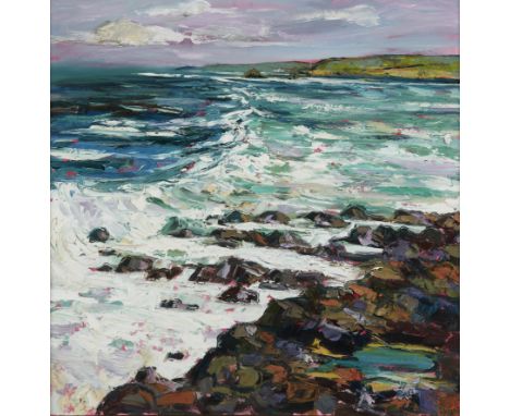
Lot 419
Judith L Brigland, Australian/Scottish b.1962 - Big Wave, Antrim Coast, 2008; oil on canvas, signed lower right 'J Brigland' titled and dated to Artist's label attached to the reverse, 81 x 80 cm Provenance: with Thompson's Aldeburgh, stock no.13125 (according to the label attached to the reverse of the frame); private collection
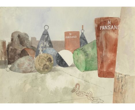
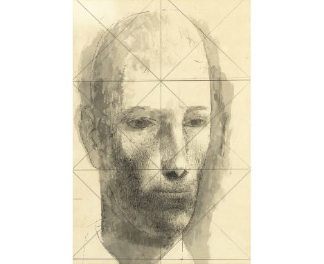
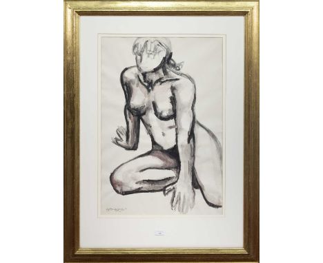
Lot 17
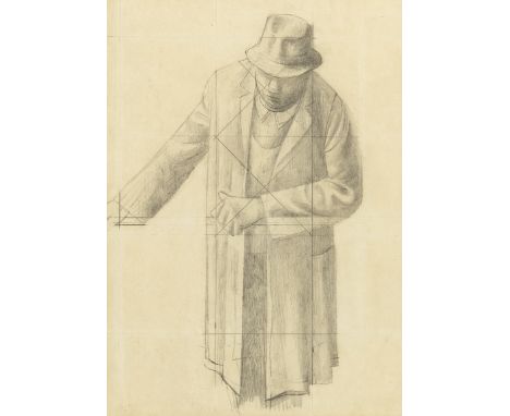
Reginald Brill (British, 1902-1974)Study of Buoys watercolour on paper24 x 34cm (9 7/16 x 13 3/8in).Footnotes:ProvenanceWith The Phoenix Gallery, Lavenham, where acquired by the family of the present owner, circa 1974, and thence by descentPrivate Collection, U.K.'Reginald Brill had quite a distinguished presence – he would now be called charismatic. He was a tall, upright man, who with his beard and air of nonchalance looked the part of the slightly bohemian artist' – Les Duxbury The following collection of works, acquired directly from the retrospective of the artist at Phoenix Gallery in 1974, provide a detailed overview of the artist's unique working methods and conceptual concerns. Described by Judith Bumpus as an English social realist and narrative painter, Brill's work primarily depicts the lives of ordinary people and the landscapes that they inhabit. The Gardener (lot 27), The Stockman (lot 25) and The Working Man (lot 23) showcase this commitment to portraying those who are traditionally overlooked by society. The artist completed his studies at the Slade School of Art between 1920 and 1923 under the tutelage of Henry Tonks, whose commitment to figurative painting can be detected in Brill's work. Reginald Brill's reputation as a painter was cemented when he won a scholarship to the British School of Rome, for the 1927 oil painting The Expulsion in Eden. The following two years in Rome had a lasting impact on Brill's practice. An interest in composition and Renaissance art are evident in Brill's method of producing detailed preparatory drawings prior to executing larger paintings. Lots 17 – 27 include a number of these studies, ranging from the figurative, such as The Gardener (lot 27), to landscapes, such as Study of Buoys and Chains (lot 20). It was also in Rome that Brill developed his characteristic pointilliste or stippled drawing technique, which is most evident in Head Studies (lot 24). Many of the pieces in this collection are keenly observed depictions of Harwich (lots 17-21), a town that is located on the estuaries of the Stour and Orwell rivers. Brill's fascination with Harwich led to the production of a number of preparatory drawings and paintings, in addition to the larger completed oil The Buoys (lot 21). The large oil demonstrates that, although Brill is best known for his figurative works, concerned with depicting working-class people, he was also highly concerned with form and colour. In the words of Judith Bumpus, the buoys at Harwich were 'ready-made still lifes', that were 'a surprising, but perfect, subject for his explorations of colour'. Perhaps best known for his role as Head of Kingston School of Art from 1934 to 1962, recognition of Brill's work faded after his death in comparison to his contemporaries, such as Stanley Spencer, and he is only now beginning to receive the attention that such a varied and influential practice is due. This collection of works offers the opportunity to acquire pieces which have remained in a private collection since Brill's death, on 14 June 1974. Ranging from the deeply personal self-portrait of himself in a library (lot 26), to the compositionally rigorous Study of Buoys and Chains (lot 20), the following lots present a unique opportunity to acquire a work by one of 20th Century Britain's great artists and educators.This lot is subject to the following lot symbols: ARAR Goods subject to Artists Resale Right Additional Premium.For further information on this lot please visit Bonhams.com
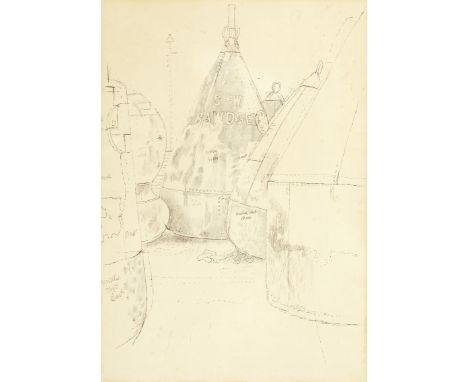
Lot 18
Reginald Brill (British, 1902-1974)Buoys at Harwich annotated with colour notes; titled 'Buoys/At/Harwich' (on sheet verso)ball-point pen and pencil on paper31.5 x 22cm (12 3/8 x 8 11/16in).Footnotes:ProvenanceWith The Phoenix Gallery, Lavenham, where acquired by the family of the present owner, circa 1974, and thence by descentPrivate Collection, U.K.'Reginald Brill had quite a distinguished presence – he would now be called charismatic. He was a tall, upright man, who with his beard and air of nonchalance looked the part of the slightly bohemian artist' – Les Duxbury The following collection of works, acquired directly from the retrospective of the artist at Phoenix Gallery in 1974, provide a detailed overview of the artist's unique working methods and conceptual concerns. Described by Judith Bumpus as an English social realist and narrative painter, Brill's work primarily depicts the lives of ordinary people and the landscapes that they inhabit. The Gardener (lot 27), The Stockman (lot 25) and The Working Man (lot 23) showcase this commitment to portraying those who are traditionally overlooked by society. The artist completed his studies at the Slade School of Art between 1920 and 1923 under the tutelage of Henry Tonks, whose commitment to figurative painting can be detected in Brill's work. Reginald Brill's reputation as a painter was cemented when he won a scholarship to the British School of Rome, for the 1927 oil painting The Expulsion in Eden. The following two years in Rome had a lasting impact on Brill's practice. An interest in composition and Renaissance art are evident in Brill's method of producing detailed preparatory drawings prior to executing larger paintings. Lots 17 – 27 include a number of these studies, ranging from the figurative, such as The Gardener (lot 27), to landscapes, such as Study of Buoys and Chains (lot 20). It was also in Rome that Brill developed his characteristic pointilliste or stippled drawing technique, which is most evident in Head Studies (lot 24). Many of the pieces in this collection are keenly observed depictions of Harwich (lots 17-21), a town that is located on the estuaries of the Stour and Orwell rivers. Brill's fascination with Harwich led to the production of a number of preparatory drawings and paintings, in addition to the larger completed oil The Buoys (lot 21). The large oil demonstrates that, although Brill is best known for his figurative works, concerned with depicting working-class people, he was also highly concerned with form and colour. In the words of Judith Bumpus, the buoys at Harwich were 'ready-made still lifes', that were 'a surprising, but perfect, subject for his explorations of colour'. Perhaps best known for his role as Head of Kingston School of Art from 1934 to 1962, recognition of Brill's work faded after his death in comparison to his contemporaries, such as Stanley Spencer, and he is only now beginning to receive the attention that such a varied and influential practice is due. This collection of works offers the opportunity to acquire pieces which have remained in a private collection since Brill's death, on 14 June 1974. Ranging from the deeply personal self-portrait of himself in a library (lot 26), to the compositionally rigorous Study of Buoys and Chains (lot 20), the following lots present a unique opportunity to acquire a work by one of 20th Century Britain's great artists and educators.This lot is subject to the following lot symbols: ARAR Goods subject to Artists Resale Right Additional Premium.For further information on this lot please visit Bonhams.com
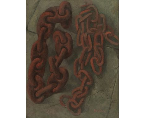
Lot 19
Reginald Brill (British, 1902-1974)Chains signed 'Reginald Brill' (lower right); further signed 'Reginald Brill' (on frame verso)oil on board28 x 22cm (11 x 8 11/16in).Footnotes:ProvenanceWith The Phoenix Gallery, Lavenham, where acquired by the family of the present owner, circa 1974, and thence by descentPrivate Collection, U.K.'Reginald Brill had quite a distinguished presence – he would now be called charismatic. He was a tall, upright man, who with his beard and air of nonchalance looked the part of the slightly bohemian artist' – Les Duxbury The following collection of works, acquired directly from the retrospective of the artist at Phoenix Gallery in 1974, provide a detailed overview of the artist's unique working methods and conceptual concerns. Described by Judith Bumpus as an English social realist and narrative painter, Brill's work primarily depicts the lives of ordinary people and the landscapes that they inhabit. The Gardener (lot 27), The Stockman (lot 25) and The Working Man (lot 23) showcase this commitment to portraying those who are traditionally overlooked by society. The artist completed his studies at the Slade School of Art between 1920 and 1923 under the tutelage of Henry Tonks, whose commitment to figurative painting can be detected in Brill's work. Reginald Brill's reputation as a painter was cemented when he won a scholarship to the British School of Rome, for the 1927 oil painting The Expulsion in Eden. The following two years in Rome had a lasting impact on Brill's practice. An interest in composition and Renaissance art are evident in Brill's method of producing detailed preparatory drawings prior to executing larger paintings. Lots 17 – 27 include a number of these studies, ranging from the figurative, such as The Gardener (lot 27), to landscapes, such as Study of Buoys and Chains (lot 20). It was also in Rome that Brill developed his characteristic pointilliste or stippled drawing technique, which is most evident in Head Studies (lot 24). Many of the pieces in this collection are keenly observed depictions of Harwich (lots 17-21), a town that is located on the estuaries of the Stour and Orwell rivers. Brill's fascination with Harwich led to the production of a number of preparatory drawings and paintings, in addition to the larger completed oil The Buoys (lot 21). The large oil demonstrates that, although Brill is best known for his figurative works, concerned with depicting working-class people, he was also highly concerned with form and colour. In the words of Judith Bumpus, the buoys at Harwich were 'ready-made still lifes', that were 'a surprising, but perfect, subject for his explorations of colour'. Perhaps best known for his role as Head of Kingston School of Art from 1934 to 1962, recognition of Brill's work faded after his death in comparison to his contemporaries, such as Stanley Spencer, and he is only now beginning to receive the attention that such a varied and influential practice is due. This collection of works offers the opportunity to acquire pieces which have remained in a private collection since Brill's death, on 14 June 1974. Ranging from the deeply personal self-portrait of himself in a library (lot 26), to the compositionally rigorous Study of Buoys and Chains (lot 20), the following lots present a unique opportunity to acquire a work by one of 20th Century Britain's great artists and educators.This lot is subject to the following lot symbols: ARAR Goods subject to Artists Resale Right Additional Premium.For further information on this lot please visit Bonhams.com
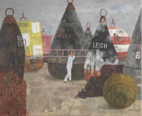
Lot 21
Reginald Brill (British, 1902-1974)The Buoys signed 'Reginald Brill' (lower right)oil on board59 x 72cm (23 1/4 x 28 3/8in).Footnotes:ProvenanceWith The Phoenix Gallery, Lavenham, where acquired by the family of the present owner, circa 1974, and thence by descentPrivate Collection, U.K.'Reginald Brill had quite a distinguished presence – he would now be called charismatic. He was a tall, upright man, who with his beard and air of nonchalance looked the part of the slightly bohemian artist' – Les Duxbury The following collection of works, acquired directly from the retrospective of the artist at Phoenix Gallery in 1974, provide a detailed overview of the artist's unique working methods and conceptual concerns. Described by Judith Bumpus as an English social realist and narrative painter, Brill's work primarily depicts the lives of ordinary people and the landscapes that they inhabit. The Gardener (lot 27), The Stockman (lot 25) and The Working Man (lot 23) showcase this commitment to portraying those who are traditionally overlooked by society. The artist completed his studies at the Slade School of Art between 1920 and 1923 under the tutelage of Henry Tonks, whose commitment to figurative painting can be detected in Brill's work. Reginald Brill's reputation as a painter was cemented when he won a scholarship to the British School of Rome, for the 1927 oil painting The Expulsion in Eden. The following two years in Rome had a lasting impact on Brill's practice. An interest in composition and Renaissance art are evident in Brill's method of producing detailed preparatory drawings prior to executing larger paintings. Lots 17 – 27 include a number of these studies, ranging from the figurative, such as The Gardener (lot 27), to landscapes, such as Study of Buoys and Chains (lot 20). It was also in Rome that Brill developed his characteristic pointilliste or stippled drawing technique, which is most evident in Head Studies (lot 24). Many of the pieces in this collection are keenly observed depictions of Harwich (lots 17-21), a town that is located on the estuaries of the Stour and Orwell rivers. Brill's fascination with Harwich led to the production of a number of preparatory drawings and paintings, in addition to the larger completed oil The Buoys (lot 21). The large oil demonstrates that, although Brill is best known for his figurative works, concerned with depicting working-class people, he was also highly concerned with form and colour. In the words of Judith Bumpus, the buoys at Harwich were 'ready-made still lifes', that were 'a surprising, but perfect, subject for his explorations of colour'. Perhaps best known for his role as Head of Kingston School of Art from 1934 to 1962, recognition of Brill's work faded after his death in comparison to his contemporaries, such as Stanley Spencer, and he is only now beginning to receive the attention that such a varied and influential practice is due. This collection of works offers the opportunity to acquire pieces which have remained in a private collection since Brill's death, on 14 June 1974. Ranging from the deeply personal self-portrait of himself in a library (lot 26), to the compositionally rigorous Study of Buoys and Chains (lot 20), the following lots present a unique opportunity to acquire a work by one of 20th Century Britain's great artists and educators.This lot is subject to the following lot symbols: ARAR Goods subject to Artists Resale Right Additional Premium.For further information on this lot please visit Bonhams.com
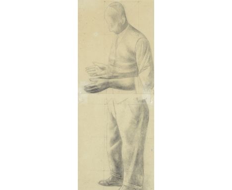
Lot 22
Reginald Brill (British, 1902-1974)Workman's Head pencil, pen and ink and wash on paper, squared for transfer32.5 x 21.5cm (12 13/16 x 8 7/16in).Footnotes:ProvenanceWith The Phoenix Gallery, Lavenham, where acquired by the family of the present owner, circa 1974, and thence by descentPrivate Collection, U.K.'Reginald Brill had quite a distinguished presence – he would now be called charismatic. He was a tall, upright man, who with his beard and air of nonchalance looked the part of the slightly bohemian artist' – Les Duxbury The following collection of works, acquired directly from the retrospective of the artist at Phoenix Gallery in 1974, provide a detailed overview of the artist's unique working methods and conceptual concerns. Described by Judith Bumpus as an English social realist and narrative painter, Brill's work primarily depicts the lives of ordinary people and the landscapes that they inhabit. The Gardener (lot 27), The Stockman (lot 25) and The Working Man (lot 23) showcase this commitment to portraying those who are traditionally overlooked by society. The artist completed his studies at the Slade School of Art between 1920 and 1923 under the tutelage of Henry Tonks, whose commitment to figurative painting can be detected in Brill's work. Reginald Brill's reputation as a painter was cemented when he won a scholarship to the British School of Rome, for the 1927 oil painting The Expulsion in Eden. The following two years in Rome had a lasting impact on Brill's practice. An interest in composition and Renaissance art are evident in Brill's method of producing detailed preparatory drawings prior to executing larger paintings. Lots 17 – 27 include a number of these studies, ranging from the figurative, such as The Gardener (lot 27), to landscapes, such as Study of Buoys and Chains (lot 20). It was also in Rome that Brill developed his characteristic pointilliste or stippled drawing technique, which is most evident in Head Studies (lot 24). Many of the pieces in this collection are keenly observed depictions of Harwich (lots 17-21), a town that is located on the estuaries of the Stour and Orwell rivers. Brill's fascination with Harwich led to the production of a number of preparatory drawings and paintings, in addition to the larger completed oil The Buoys (lot 21). The large oil demonstrates that, although Brill is best known for his figurative works, concerned with depicting working-class people, he was also highly concerned with form and colour. In the words of Judith Bumpus, the buoys at Harwich were 'ready-made still lifes', that were 'a surprising, but perfect, subject for his explorations of colour'. Perhaps best known for his role as Head of Kingston School of Art from 1934 to 1962, recognition of Brill's work faded after his death in comparison to his contemporaries, such as Stanley Spencer, and he is only now beginning to receive the attention that such a varied and influential practice is due. This collection of works offers the opportunity to acquire pieces which have remained in a private collection since Brill's death, on 14 June 1974. Ranging from the deeply personal self-portrait of himself in a library (lot 26), to the compositionally rigorous Study of Buoys and Chains (lot 20), the following lots present a unique opportunity to acquire a work by one of 20th Century Britain's great artists and educators.This lot is subject to the following lot symbols: ARAR Goods subject to Artists Resale Right Additional Premium.For further information on this lot please visit Bonhams.com
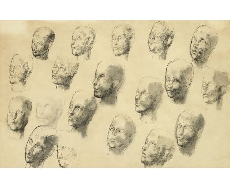
Lot 24
Reginald Brill (British, 1902-1974)Head Studies pen and ink and wash on paper34 x 53cm (13 3/8 x 20 7/8in).Footnotes:ProvenanceWith The Phoenix Gallery, Lavenham, where acquired by the family of the present owner, circa 1974, and thence by descentPrivate Collection, U.K.'Reginald Brill had quite a distinguished presence – he would now be called charismatic. He was a tall, upright man, who with his beard and air of nonchalance looked the part of the slightly bohemian artist' – Les Duxbury The following collection of works, acquired directly from the retrospective of the artist at Phoenix Gallery in 1974, provide a detailed overview of the artist's unique working methods and conceptual concerns. Described by Judith Bumpus as an English social realist and narrative painter, Brill's work primarily depicts the lives of ordinary people and the landscapes that they inhabit. The Gardener (lot 27), The Stockman (lot 25) and The Working Man (lot 23) showcase this commitment to portraying those who are traditionally overlooked by society. The artist completed his studies at the Slade School of Art between 1920 and 1923 under the tutelage of Henry Tonks, whose commitment to figurative painting can be detected in Brill's work. Reginald Brill's reputation as a painter was cemented when he won a scholarship to the British School of Rome, for the 1927 oil painting The Expulsion in Eden. The following two years in Rome had a lasting impact on Brill's practice. An interest in composition and Renaissance art are evident in Brill's method of producing detailed preparatory drawings prior to executing larger paintings. Lots 17 – 27 include a number of these studies, ranging from the figurative, such as The Gardener (lot 27), to landscapes, such as Study of Buoys and Chains (lot 20). It was also in Rome that Brill developed his characteristic pointilliste or stippled drawing technique, which is most evident in Head Studies (lot 24). Many of the pieces in this collection are keenly observed depictions of Harwich (lots 17-21), a town that is located on the estuaries of the Stour and Orwell rivers. Brill's fascination with Harwich led to the production of a number of preparatory drawings and paintings, in addition to the larger completed oil The Buoys (lot 21). The large oil demonstrates that, although Brill is best known for his figurative works, concerned with depicting working-class people, he was also highly concerned with form and colour. In the words of Judith Bumpus, the buoys at Harwich were 'ready-made still lifes', that were 'a surprising, but perfect, subject for his explorations of colour'. Perhaps best known for his role as Head of Kingston School of Art from 1934 to 1962, recognition of Brill's work faded after his death in comparison to his contemporaries, such as Stanley Spencer, and he is only now beginning to receive the attention that such a varied and influential practice is due. This collection of works offers the opportunity to acquire pieces which have remained in a private collection since Brill's death, on 14 June 1974. Ranging from the deeply personal self-portrait of himself in a library (lot 26), to the compositionally rigorous Study of Buoys and Chains (lot 20), the following lots present a unique opportunity to acquire a work by one of 20th Century Britain's great artists and educators.This lot is subject to the following lot symbols: ARAR Goods subject to Artists Resale Right Additional Premium.For further information on this lot please visit Bonhams.com
Lot 25
Reginald Brill (British, 1902-1974)The Stockman pencil on paper, squared for transfer21.5 x 16cm (8 7/16 x 6 5/16in).Footnotes:ProvenanceWith The Phoenix Gallery, Lavenham, where acquired by the family of the present owner, circa 1974, and thence by descentPrivate Collection, U.K.'Reginald Brill had quite a distinguished presence – he would now be called charismatic. He was a tall, upright man, who with his beard and air of nonchalance looked the part of the slightly bohemian artist' – Les Duxbury The following collection of works, acquired directly from the retrospective of the artist at Phoenix Gallery in 1974, provide a detailed overview of the artist's unique working methods and conceptual concerns. Described by Judith Bumpus as an English social realist and narrative painter, Brill's work primarily depicts the lives of ordinary people and the landscapes that they inhabit. The Gardener (lot 27), The Stockman (lot 25) and The Working Man (lot 23) showcase this commitment to portraying those who are traditionally overlooked by society. The artist completed his studies at the Slade School of Art between 1920 and 1923 under the tutelage of Henry Tonks, whose commitment to figurative painting can be detected in Brill's work. Reginald Brill's reputation as a painter was cemented when he won a scholarship to the British School of Rome, for the 1927 oil painting The Expulsion in Eden. The following two years in Rome had a lasting impact on Brill's practice. An interest in composition and Renaissance art are evident in Brill's method of producing detailed preparatory drawings prior to executing larger paintings. Lots 17 – 27 include a number of these studies, ranging from the figurative, such as The Gardener (lot 27), to landscapes, such as Study of Buoys and Chains (lot 20). It was also in Rome that Brill developed his characteristic pointilliste or stippled drawing technique, which is most evident in Head Studies (lot 24). Many of the pieces in this collection are keenly observed depictions of Harwich (lots 17-21), a town that is located on the estuaries of the Stour and Orwell rivers. Brill's fascination with Harwich led to the production of a number of preparatory drawings and paintings, in addition to the larger completed oil The Buoys (lot 21). The large oil demonstrates that, although Brill is best known for his figurative works, concerned with depicting working-class people, he was also highly concerned with form and colour. In the words of Judith Bumpus, the buoys at Harwich were 'ready-made still lifes', that were 'a surprising, but perfect, subject for his explorations of colour'. Perhaps best known for his role as Head of Kingston School of Art from 1934 to 1962, recognition of Brill's work faded after his death in comparison to his contemporaries, such as Stanley Spencer, and he is only now beginning to receive the attention that such a varied and influential practice is due. This collection of works offers the opportunity to acquire pieces which have remained in a private collection since Brill's death, on 14 June 1974. Ranging from the deeply personal self-portrait of himself in a library (lot 26), to the compositionally rigorous Study of Buoys and Chains (lot 20), the following lots present a unique opportunity to acquire a work by one of 20th Century Britain's great artists and educators.This lot is subject to the following lot symbols: ARAR Goods subject to Artists Resale Right Additional Premium.For further information on this lot please visit Bonhams.com
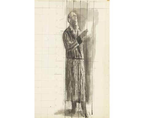
Lot 26
Reginald Brill (British, 1902-1974)Sketch for 'The Artist in His Library' titled 'Sketch for/The artist in his library' (on sheet verso)pen and ink, pencil and wash on paper, squared for transfer38 x 24cm (14 15/16 x 9 7/16in).with a further pen and ink and ink head study of a man, on the reverse, by the same handFootnotes:ProvenanceWith The Phoenix Gallery, Lavenham, where acquired by the family of the present owner, circa 1974, and thence by descentPrivate Collection, U.K.'Reginald Brill had quite a distinguished presence – he would now be called charismatic. He was a tall, upright man, who with his beard and air of nonchalance looked the part of the slightly bohemian artist' – Les Duxbury The following collection of works, acquired directly from the retrospective of the artist at Phoenix Gallery in 1974, provide a detailed overview of the artist's unique working methods and conceptual concerns. Described by Judith Bumpus as an English social realist and narrative painter, Brill's work primarily depicts the lives of ordinary people and the landscapes that they inhabit. The Gardener (lot 27), The Stockman (lot 25) and The Working Man (lot 23) showcase this commitment to portraying those who are traditionally overlooked by society. The artist completed his studies at the Slade School of Art between 1920 and 1923 under the tutelage of Henry Tonks, whose commitment to figurative painting can be detected in Brill's work. Reginald Brill's reputation as a painter was cemented when he won a scholarship to the British School of Rome, for the 1927 oil painting The Expulsion in Eden. The following two years in Rome had a lasting impact on Brill's practice. An interest in composition and Renaissance art are evident in Brill's method of producing detailed preparatory drawings prior to executing larger paintings. Lots 17 – 27 include a number of these studies, ranging from the figurative, such as The Gardener (lot 27), to landscapes, such as Study of Buoys and Chains (lot 20). It was also in Rome that Brill developed his characteristic pointilliste or stippled drawing technique, which is most evident in Head Studies (lot 24). Many of the pieces in this collection are keenly observed depictions of Harwich (lots 17-21), a town that is located on the estuaries of the Stour and Orwell rivers. Brill's fascination with Harwich led to the production of a number of preparatory drawings and paintings, in addition to the larger completed oil The Buoys (lot 21). The large oil demonstrates that, although Brill is best known for his figurative works, concerned with depicting working-class people, he was also highly concerned with form and colour. In the words of Judith Bumpus, the buoys at Harwich were 'ready-made still lifes', that were 'a surprising, but perfect, subject for his explorations of colour'. Perhaps best known for his role as Head of Kingston School of Art from 1934 to 1962, recognition of Brill's work faded after his death in comparison to his contemporaries, such as Stanley Spencer, and he is only now beginning to receive the attention that such a varied and influential practice is due. This collection of works offers the opportunity to acquire pieces which have remained in a private collection since Brill's death, on 14 June 1974. Ranging from the deeply personal self-portrait of himself in a library (lot 26), to the compositionally rigorous Study of Buoys and Chains (lot 20), the following lots present a unique opportunity to acquire a work by one of 20th Century Britain's great artists and educators.This lot is subject to the following lot symbols: ARAR Goods subject to Artists Resale Right Additional Premium.For further information on this lot please visit Bonhams.com
Lot 27
Reginald Brill (British, 1902-1974)The Gardener pencil on two sheets of paper, squared for transfer49 x 19.5cm (19 5/16 x 7 11/16in).Footnotes:ProvenanceWith The Phoenix Gallery, Lavenham, where acquired by the family of the present owner, circa 1974, and thence by descentPrivate Collection, U.K.'Reginald Brill had quite a distinguished presence – he would now be called charismatic. He was a tall, upright man, who with his beard and air of nonchalance looked the part of the slightly bohemian artist' – Les Duxbury The following collection of works, acquired directly from the retrospective of the artist at Phoenix Gallery in 1974, provide a detailed overview of the artist's unique working methods and conceptual concerns. Described by Judith Bumpus as an English social realist and narrative painter, Brill's work primarily depicts the lives of ordinary people and the landscapes that they inhabit. The Gardener (lot 27), The Stockman (lot 25) and The Working Man (lot 23) showcase this commitment to portraying those who are traditionally overlooked by society. The artist completed his studies at the Slade School of Art between 1920 and 1923 under the tutelage of Henry Tonks, whose commitment to figurative painting can be detected in Brill's work. Reginald Brill's reputation as a painter was cemented when he won a scholarship to the British School of Rome, for the 1927 oil painting The Expulsion in Eden. The following two years in Rome had a lasting impact on Brill's practice. An interest in composition and Renaissance art are evident in Brill's method of producing detailed preparatory drawings prior to executing larger paintings. Lots 17 – 27 include a number of these studies, ranging from the figurative, such as The Gardener (lot 27), to landscapes, such as Study of Buoys and Chains (lot 20). It was also in Rome that Brill developed his characteristic pointilliste or stippled drawing technique, which is most evident in Head Studies (lot 24). Many of the pieces in this collection are keenly observed depictions of Harwich (lots 17-21), a town that is located on the estuaries of the Stour and Orwell rivers. Brill's fascination with Harwich led to the production of a number of preparatory drawings and paintings, in addition to the larger completed oil The Buoys (lot 21). The large oil demonstrates that, although Brill is best known for his figurative works, concerned with depicting working-class people, he was also highly concerned with form and colour. In the words of Judith Bumpus, the buoys at Harwich were 'ready-made still lifes', that were 'a surprising, but perfect, subject for his explorations of colour'. Perhaps best known for his role as Head of Kingston School of Art from 1934 to 1962, recognition of Brill's work faded after his death in comparison to his contemporaries, such as Stanley Spencer, and he is only now beginning to receive the attention that such a varied and influential practice is due. This collection of works offers the opportunity to acquire pieces which have remained in a private collection since Brill's death, on 14 June 1974. Ranging from the deeply personal self-portrait of himself in a library (lot 26), to the compositionally rigorous Study of Buoys and Chains (lot 20), the following lots present a unique opportunity to acquire a work by one of 20th Century Britain's great artists and educators.This lot is subject to the following lot symbols: ARAR Goods subject to Artists Resale Right Additional Premium.For further information on this lot please visit Bonhams.com
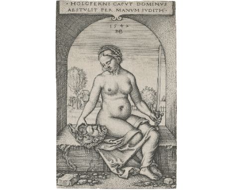
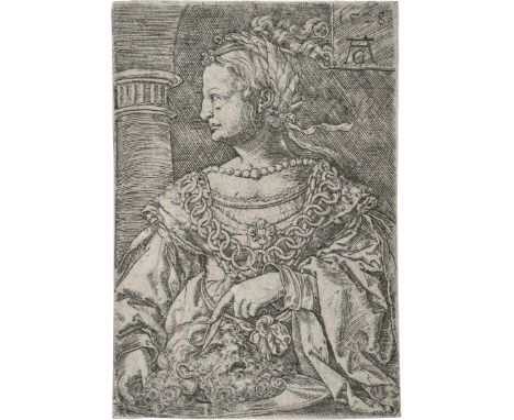
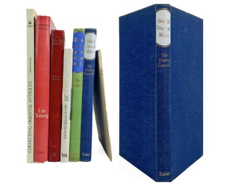
Lot 5018
Beham, Hans Sebald -- Judith im Fensterbogen sitzend. Kupferstich. 7,4 x 4,8 cm. 1547. B. 12, Pauli 13, Hollstein 12 III (von IV).Vor den weiteren Diagonalen. Ganz ausgezeichneter, klarer Druck mit der vollen Darstellung, partiell Spuren der Einfassungslinie. Leicht angestaubt, dünne Papierstellen, winziges, kaum merkliches Nadellöchlein über dem Kopf Judiths, sonst tadellos. - Wir bitten darum, Zustandsberichte zu den Losen zu erfragen, da der Erhaltungszustand nur in Ausnahmefällen im Katalog angegeben ist. - Please ask for condition reports for individual lots, as the condition is usually not mentioned in the catalogue.
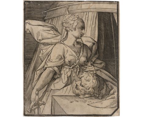
Lot 5155
Niederländisch -- um 1600. Judith mit dem Haupt des Holofernes. Holzschnitt. 20,7 xs 17,2 cm. Unbeschrieben.Der anonyme Holzschnitt zeichnet sich durch seinen dynamischen, souveränen Duktus aus. Das Thema der Judith wurde auch von Cristoffel van Sichem I in der gleichen Technik behandelt, jedoch ist seine Fassung verfeinerter in der Ausführung. Die kraftvolle, spannungsgeladene Linienführung und der Figurentypus sind wesentlich von der Goltzius-Schule geprägt. Das suggestive Blatt fehlt in den Sammlungen des Rijksmuseum, Amsterdam und des British Museum, London. Ausgezeichneter Druck mit feinem Rändchen. Etwas angestaubt und fleckig, kl. Erhaltungsmängel, vereinzelte dünne Papierstellen verso, der Gesamteindruck jedoch gut. Verso Skizze in Rötel. - Wir bitten darum, Zustandsberichte zu den Losen zu erfragen, da der Erhaltungszustand nur in Ausnahmefällen im Katalog angegeben ist. - Please ask for condition reports for individual lots, as the condition is usually not mentioned in the catalogue.
Lot 5510
Aldegrever, Heinrich -- Judith mit dem Haupt des Holofernes. Kupferstich. 8 x 5,6 cm. 1528. B. 34, Hollstein 34, Mielke (New Hollstein) 34.Ausgezeichneter Druck mit der vollen Darstellung. Die untere linke Eckspitze ergänzt und mit der Feder retuschiert, aufgezogen, sonst schön. Beigegeben von demselben der Kupferstich "Pauperitas" (Hollstein 113). Errata/Addenda:Anmerkung zur Darstellung: Es handelt sich, wie Andrew S. Winston in seinem Beitrag im Print Quarterly XXXIX, 2022, 4, S. 438-440 argumentiert, nicht um Judith mit dem Haupt des Holofernes, sondern um Herodias mit dem Haupt Johannes des Täufers. // Note on the illustration: As Andrew S. Winston argues in his article in Print Quarterly XXXIX, 2022, 4, pp. 438-440, it is not Judith with the head of Holofernes, but Herodias with the head of John the Baptist. - Wir bitten darum, Zustandsberichte zu den Losen zu erfragen, da der Erhaltungszustand nur in Ausnahmefällen im Katalog angegeben ist. - Please ask for condition reports for individual lots, as the condition is usually not mentioned in the catalogue.
![Franz von Bayros - Die Bonbonnière. Galante und artige Sammlung erotischer Phantasien. Von Choisy le Conin [Franz v. Bayros],](https://cdn.globalauctionplatform.com/ba1b0711-8e06-4995-a026-b0a701882881/595d2319-f4a2-4d85-bfd0-b0a900d373c4/468x382.jpg)
Lot 179
Franz von Bayros - Die Bonbonnière. Galante und artige Sammlung erotischer Phantasien. Von Choisy le Conin [Franz v. Bayros], mit Paraphrasen in Poesie und Prosa von Amadée de la Houlette [Franz Blei]. Lieferung [1-5, davon 3-5 unter dem Titel] Der Hirschpark. Galante und artige Sammlung duftiger Phantasien von Emil Sartori, mit Paraphrasen in Poesie von Amadée de la Houlette [Franz Blei]. Wien und Leipzig, C. W. Stern 1907. Mit zwölf Radierung von Franz von Bayros und 18 von Emil Sartori. Lose Doppelblätter und Radierungen in fünf Originallieferungsumschlägen.Vollständiges Exemplar mit allen fünf erschienenen Lieferungen und allen 30 Radierungen. - Exemplar 226 von 500 Exemplaren (Gesamt 530). - Privatdruck, nur für Subskribenten herausgegeben und nicht im Handel erschienen. - Die Radierungen werden begleitet von erotischen Texten von Franz Blei. Allein Emil Sartori erscheint unter seinem Klarnamen. Die Poesien bzw. Radierungen der fünf Teile tragen folgende Titel: I. Introduction; Kinder; Ringwerfen; Der Dienst; Judith; Rissa. - II. Die Klavierlehrerin; Der Besuch; Die Fliege; Die Nashornjägerin; Schlangenzauber; Nun sprich! - III. Die Jungfrau; Die Tänzerin; Minie; Die Pfauenfeder; Haremsfest; Urteil der Parisia. - IV. Die Pinguine; Der Freund; Die Äpfel; Huberta; Lockung; Die Forelle. - V. Die Beute; Souper; Erschöpfung; Der Antrag; Der junge Wald; Die beiden Alten. - Beilage: Verlagsanzeige an die Subskribenten, dass die Hefte 3ff. unter dem Titel »Der Hirschpark« erschienen werden. Auch wird der Wechsel des Künstlers angezeigt, nicht ohne eine unverhohlene Kritik an Bayros: »Die Illustrationen sind von einem ersten Wiener Radierer und es ist uns gelungen, weit Wertvolleres als in den ersten zwei Heften zu bieten.« Die hier noch angekündigte sechste Lieferung ist nie erschienen. - Texte auf Japan, die Radierungen auf Velin. - Unbeschnitten, lose eingelegt in die fünf typographisch betitelten Originalumschläge. - Die Radierungen der ersten drei Lieferungen mit feinen Seidenvorblättern mit floralem Muster. - Aus der Bibliothek des Heidelberger Verlegers Carl Winter mit dessen »Des Knaben Wunderhorn-Exlibris« in den Umschlägen 1 und 2. - Vollständig und so gut erhalten sehr selten.34,5 : 29,5 cm. [2], 67 Blätter, 30 Radierungen. - Umschläge leicht fleckig und mit vereinzelten Einrissen, Hinterumschlag von III und V mit Wasserrand. - Ganz vereinzelt minimal fingerfleckig, 1 Radierung mit Randknick.Brettschneider 33 (ungenau). - Hayn/Gotendorf IX, 43 (korrigiert auf 5 Lieferungen). - Stern-Szana 239 (»Das Werk ist jetzt sehr selten«, er selbst besaß nur die ersten drei Lieferungen)

Lot 151
1956 Rolls-Royce Silver Cloud I Transmission: automaticMileage:75364The Rolls-Royce Silver Cloud was the core model of the Rolls-Royce Motor Cars range from April 1955 until March 1966. It replaced the Silver Dawn and was, in turn, replaced by the Silver Shadow. The J.P. Blatchley design was a major change from the pre-war models and the highly derivative Silver Dawn. As part of a range rationalisation, the Bentley S1 is also very similar apart from, of course, its radiator grille. The chassis was a simple steel box section, welded together and very rigid. Construction retained the traditional split between chassis and body which facilitated the provision of special bodied versions, although in practice the overwhelming majority of cars were delivered with the standard steel body shell, produced by Pressed Steel, and employing lightweight aluminium-based alloy for the doors, bonnet, and boot lid. The engine was a 155hp six-cylinder unit with inlet over exhaust valves; twin SU carburettors were added in September 1957 and standard was a four-speed, automatic transmission. First registered on 28th March 1956, the handsome Silver Cloud offered here presents beautifully in its silver paintwork and Slate Blue leather interior. The factory specification includes central front and rear armrests, Smiths gauges, a three-spoke Bakelite steering wheel, folding rear tables and manual windows. The extensive burr walnut inlays, rear tables and thick grey sheepskin over mats all present very well. Supplied by Glovers of Ripon to Dr J.F.E. Johnson of Sunderland, it is noted in a letter by the second owner, Harry Cecil Brown of Leeds, his reluctance to part with the Rolls and that the car had featured in TV series Stay Lucky starring Dennis Waterman, as well as the Judith Krantz mini-series Till We Meet Again starring Hugh Grant and Courtney Cox. Reportedly treated to a comprehensive restoration and repaint during the course of 2001, prior to it being dry stored in a Carcoon for 12 years, and then recommissioned in 2013 by Nottingham based mark experts, Riste Motor Company, with work that included the replacement of the distributor cap, rotor arm, points and condensers, drive belts, rocker cover, bushes and the battery. The car has also benefitted from having an electric cooling fan installed to help the car in modern traffic conditions. Forming part of a large private collection for the past two years, the car has always been dry stored and maintained by the vendor's personal mechanic. The vendor bought the car from a close friend of his who had owned the car from around 2015 and who also has an impressive collection that is always kept dry stored. Accompanying the car is a history file including the original Kinsman tyre pump instruction leaflet, copies of original factory build sheets, receipts, correspondence confirming the car to be genuine, historic MoT test certificates dating back to 1972 and a toolkit in the boot which includes a jack. Boasting an impressive provenance, having been featured in a couple of A list television programmes, this handsome 50's luxury saloon is not to be missed and is certainly one of the better Silver Cloud's we have seen.

Lot 49
JEWELLERY BOOKS - GEMSTONE GUIDES COMPRISING; Gems: The Definitive Visual Guide, Aja Raden, DK Publishing, New York 2016 Gems from the East and West: The Doris Duke Jewelry Collection, Janet Zapata, Ulysses Dietz, et al., Doris Duke Charitable Foundation, New York 2003 The Intelligent Layman's Book of Jewellery, Jack Ogden, The Intelligent Layman Publishers Ltd., London Jewel: A Celebration of Earth's Treasures, Judith Miller, Doris Kindersley Limited, London 2016 Jewelry Guide: The Ultimate Compendium, Fabienne Reybaud, Assouline Publishing, New York 2022 My Own Dictionary, Lorenz Bäumer, Éditions de la Martinière, Paris 2007 Simon & Schuster's Guide to Gems and Precious Stones, Kennie Lyman (ed.), Simon & Schuster Inc., New York 2986 Tanzanite - Born from Lighting, Didier Brodbeck and Hayley A. Henning, Watchprint.com, Switzerland 2016 (8) The largest 34cm x 24cm Condition: For a condition report or further images please email hello@hotlotz.com at least 48 hours prior to the closing date of the auction. This is an auction of preowned and antique items. Many items are of an age or nature which precludes their being in perfect condition and you should expect general wear and tear commensurate with age and use. We strongly advise you to examine items before you bid. Condition reports are provided as a goodwill gesture and are our general assessment of damage and restoration. Whilst care is taken in their drafting, they are for guidance only. We will not be held responsible for oversights concerning damage or restoration.
Lot 166
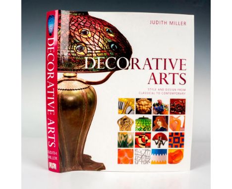
New York: DK Publishing, First American Edition 2006. 440 pages. Decorative Arts, Style and Design From Classical to Contemporary. Hardcover book with original dust cover discussing the design and craftsmanship of art, pottery, glass and textiles through the ages. ISBN: 0756623499. , Artist: Judith MillerIssued: 2006Dimensions: 10"W x 1.25"D x 12"HManufacturer: DK PublishingCountry of Origin: United StatesCondition Age related wear. Good.
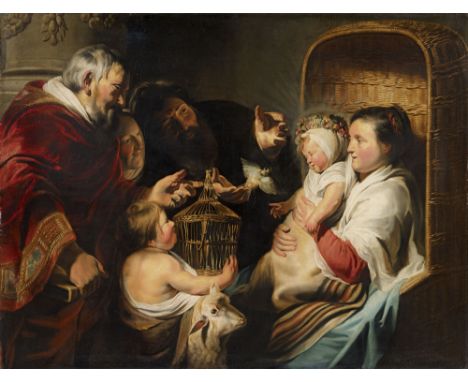
Lot 2027
Jacob Jordaens, Die heilige Familie mit Johannes dem Täufer und seinen ElternÖl auf Leinwand (doubliert). 112,5 x 148 cm.GutachtenHans Vlieghe, Bonheiden, 25.11.2011.ProvenienzDas Gemälde stammt aus der Sammlung der adligen Familie J. zur Mühlen (Westfalen), die im 18. Jahrhundert aufgebaut wurde. - Danach durch Erbgang in Familienbesitz. - 1000. Lempertz-Auktion, Köln, 17.11.2012, Lot 1134. - Westdeutsche Privatsammlung.AusstellungenMünster: Meisterwerke Holländischer und Flämischer Malerei aus Westfälischem Privatbesitz, 1939, Nr. 29, Tafel XII. - Aachen: Ausstellung Flämischer und Holländischer Gemälde aus Aachener Privatbesitz, 1955, Nr. 45, Abb. 7.LiteraturMichael Jaffé: Jacob Jordaens 1593-1678, The National Gallery of Canada, Ottawa 1968, S. 74-75. - R. A. d´Hulst: Jacob Jordaens (Ausstellungskatalog), Antwerpen 1993, S. 70-72, Abb. 11a.Maria sitzt mit dem blumenbekränzten Jesusknaben in einem Korbstuhl, sie empfangen den kleinen Johannes und dessen Eltern, den Priester Zacharias und Elisabeth, auch Joseph hat sich zur Gruppe hinzugesellt. Dieses großformatige Gemälde befand sich mehr als 200 Jahre in einer westfälischen Adelssammlung und war der kunsthistorischen Forschung im Original nicht bekannt. So kam es zu unterschiedlichen Beurteilungen des Werks; Michael Jaffé hielt es für eine eigenhändige Arbeit von Jacob Jordaens, R. A. d´Hulst zweifelte daran. Erst Hans Vlieghe konnte das Gemälde im Original studieren; er hat es als ein eigenhändiges Werk des jungen Jacob Jordaens bestätigt und um 1620 datiert – eine Schaffensperiode, so Vlieghe, in der der Künstler noch keine eigene Werkstatt führte (vgl. Gutachten vom 25.11.2011). Es handelt sich damit um die dritte Fassung dieses Themas von Jacob Jordaens´ eigener Hand, nach der ersten signierten Version im North Carolina Museum of Art, Raleigh (Abb. 2), und der zweiten in der National Gallery in London, beide mit annährend gleichen Maßen wie das vorliegende Gemälde. Wie bei anderen populären Bildthemen (etwa Aesops Fabel „Satyr und der Bauer“ oder „Das Bohnenfest“), hat Jordaens somit auch hier mehrere Fassungen geschaffen. Vergleicht man die vorliegende späteste Fassung, fallen neben kleinen Unterschieden einige markante Veränderungen auf, namentlich die Ersetzung des Vorhangs durch eine Säule und – am wichtigsten – die Ergänzung der Figur des Joseph in der Bildmitte, die von inhaltlicher und formaler Bedeutung ist: Durch ihn schließt sich die Figurenkomposition zu einem Halbkreis, während sich in den beiden Fassungen zuvor zwei Figurengruppen gegenüberstehen – was dem familiären intimen Thema angemessener erscheint.R. A. d´Hulst hat die Schaffensperiode Jacob Jordaens´, in der dieses Gemälde entstanden ist, als die der „reichen Entfaltung zwischen 1619 und 1627“ bezeichnet. Für den jungen Jordaens ging es darum, auf dem Antwerpener Kunstmarkt mit einer eigenen Bildsprache zu reüssieren und sich aus der Masse der Künstler abzuheben. Wie für den etwas Jüngeren van Dyck war auch für ihn der 16 Jahre ältere Rubens der Leitstern. So ist ohne Rubens die monumentale, ausgewogene Komposition dieses Werks nicht denkbar, ebenso wenig eine Figur wie die kraftvolle Erscheinung des Zacharias im dunkelroten Priestergewand. Ganz eigenständig und sich von Rubens absetzend ist jedoch Jordaens´ lebensnahe, intime Darstellung der Szenerie: Wie die Erwachsenen mit Entzücken den Jesusknaben betrachten; wie Maria den Besuchern stolz ihr Neugeborenes präsentiert; wie das Kind dem ihm entgegenflatternden Vogel sanft die Hand entgegenstreckt – all dies ist lebensnah geschildert, dass man meint, einem sonntäglichen Verwandtenbesuch beizuwohnen, bei dem ein Baby bewundert wird. Diese genrehaft Lebensnähe zeigt sich auch in Details wie dem Korbstuhl (der wie die gestreifte Decke in einer Reihe anderer Gemälde auftaucht) oder dem Vogelkäfig aus kleinen krummen Ästchen, der wirkt, als habe der kleine Johannes ihn selbst gebastelt. Betrachtet man den Jesusknaben, der sich behaglich gegen die Brust seiner Mutter lehnt, vergisst man geradezu, dass der Distelfink eigentlich ein Symbol für die Passion Christi ist. Wie sehr Jordaens´ alltägliche, lebensnahe Schilderung sich von der Kunst des großen Vorbildes Rubens unterscheidet, zeigt ein beliebiger Verglich, etwa mit dessen „Heilige Familie mit dem hl. Johannes und Elisabeth“ aus der Wallace Collection, dessen formale Strenge auf Raffaels Kunst rekurriert (Abb. 3). Neben Rubens ist es ein italienischer Künstler, dessen Einfluss sich in diesem Gemälde zeigt, jener Caravaggios. Jordaens konnte dessen Kunst mittelbar im Werk von Rubens studieren, der Caravaggios Werk aus Rom kannte. Darüber hinaus gab es in Antwerpen aber auch ein Hauptwerk Caravaggios zu bewundern, das über verschlungene Wege in die Stadt gelangte – das Altargemälde der Rosenkranzmadonna. Dieses war (gemeinsam mit einer wohl nach wie vor verschollenen Judith und Holofernes) in Amsterdam versteigert und von einem Konsortium flämischer Künstler um Rubens für die Paulskirche in Antwerpen erworben worden. Der junge Jordaens zählte neben Rubens, van Balen und van Dyck zu jenen Künstlern, die ein Werk für die bildliche Ausstattung der Paulskirche beisteuerten (Abb. 4). Caravaggios Einfluss offenbart sich hier in der Lichtregie und dem dramatischen Helldunkel, etwa das helle Licht, das auf Maria und Jesus fällt, das verschattete Gesicht des Zacharias oder die Schlagschatten, die sich auf den Händen Elisabeths und Josephs bilden. Licht und Schatten ordnen und rhythmisieren die Figurenkomposition und lenken den Blick des Betrachters von links nach rechts. Von Caravaggio lernte Jordaens zudem den Einsatz von Händen bzw. Gesten zur Strukturierung und Forcierung einer Erzählung (ein zentrales Element der Rosenkranzmadonna), wie hier im Bildzentrum bei Zacharias, Elisabeth und Joseph zu sehen.So bündeln sich in diesem Werk die zentralen Aspekte im künstlerischen Schaffen des jungen Jordaens: seine Auseinandersetzung mit den großen künstlerischen Vorbildern Rubens und Caravaggio und sein Streben nach einer eigenen Bildsprache, die Monumentalität und Lebensnähe miteinander verbindet. So seht das Gemälde exemplarisch für den Beginn von Jordaens Schaffensphase der „reichen Entfaltung“.Abb. 2/Ill. 2: Jacob Jordaens, Madonna mit Kind, hl. Johannes und dessen Familie / The Virgin and Child with Saint John and His Family, North Carolina Museum of Art, Raleigh © Bridgeman ImagesAbb. 3/Ill. 3: Peter Paul Rubens, Heilige Familie mit hl. Johannes und Elisabeth / Holy Family with St John und Elisabeth, Wallce Collection, London © Wallace Collection / Bridgeman ImagesAbb. 4/Ill. 4: Jacob Jordaens, Kreuzigung / Crucifixion, Sint-Paulskerk, Antwerp/Antwerpen © Bridgeman Images
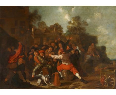
Lot 2048
Jan Miense Molenaer, BauernschlägereiÖl auf Holz (parkettiert). 83 x 115,5 cm.Signiert und datiert unten Mitte: Jan Molenaer 1653.ProvenienzGalleria Bosoni, Mailand. - Italienische PrivatsammlungJan Miense Molenaer, der mit der Malerin Judith Leyster verheiratet war, begann seine Karriere in der Manier von Dirk Hals und entwickelte sich später zu bäuerlichen Darstellungen in der Haarlemer Tradition wie Adriaen Brouwer und Adriaen van Ostade. Die vorliegende Tafel zählt zu seinem reifen Schaffen und kann aufgrund der typischen kontrapunktischen Kompositionen, der Vorliebe für Stillleben und der grotesken Darstellung der Figuren, deren Gesichtszüge durch Heiterkeit oder Wut deformiert sind, mit anderen Gemälden dieser Zeit in Verbindung gebracht werden. Zum Vergleich siehe das Gemälde "Slap Hands/Handjeklap" im Museum der Schönen Künste in Budapest, Inv.-Nr. 264.
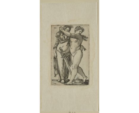
Lot 391
Kupferstich Hans Sebald Beham1500 Nürnberg - 1550 Frankfurt "Judith mit dem Haupt des Holofernes und ihrer Dienerin" in der Platte monogr. HSB, verso Sammlungsstempel in Form einer Blume u. Sammlungsstempel Lanna sowie mit Annotation von neuerer Hand, außerhalb der Plattenkante geschnitten, mit schmalem Rand. auf Büttenpapier, 11,8 x 7,4 cm (Blattmaß), o. R. Wkvz.: Pauli 12 Sammlungsstempel recto schwach durchschlagend, links winziger geschlossener Randeinriss, Ecke oben rechts restauriert (mit Papier hinterlegte, defizitäre Stelle), verso zart auf Japanpapier montiert.

Lot 536
Quantity of 1960s T & G Green Cornishware gold and white tablewares, designed by Judith Onions, comprising seven cups, six saucers, two mugs, serving plate, three large (20cm) side plates, four small (18cm) side plates, two deep sided bowls, lidded conserve pot, milk jug, two egg cups, pepper pot, mustard pot, flour dredger, sugar sifter, salt sifter (34)
Lot 3837
Andreas Wachter Mädchenbüste "Judith"datiert (20)06 und monogrammiert AW, Terrakotta farbig gefasst, stark bewegte Darstellung einer jungen Frau mit sinnend gesenktem Blick, die Haare von einem breiten dunklen Stirnband gehalten, am unteren Rand und am Zopf hinten kleinere Verluste, H 30 cm. Künstlerinfo: (1951 Chemnitz), Studium unter Volker Stelzmann und Arno Rink an der Leipziger Hochschule für Grafik- und Buchkunst (HGB), schuf Landschafts- und Figurenbilder mit meist tief in sich gekehrten Einzelfiguren oder Gruppen in verschiedenen Milieus, bei denen gefühlvoll das Wechselspiel zwischen Isolation und Interaktion beleuchtet wird, er stellte auf zahlreichen Einzelausstellungen bundesweit und auf Gruppenausstellungen in den USA, Südkorea und auf Mallorca aus. Quelle: Galerie Supper und Andreas Wachter, Andreas Wachter [2-10], 2010, S. 52 f.
Lot 412
Russell (Judith, editor). The Wood-Engravings of Gertrude Hermes, 1st edition, Aldershot: Scolar Press, 1993, numerous monochrome illustrations, original cloth in dust jacket, covers very lightly marked, folio, together with:Sidey (Tessa), The Prints of Michael Rothenstein, 1st edition, Aldershot: Scolar Press, 1993, numerous colour & monochrome illustrations, original cloth in dust jacket, large 4to, plusWolff (Paul), My First Ten Years with the Leica, 1st edition, New York: B. Westermann Co., 1930, numerous monochrome illustrations, some light marginal toning, original cloth in dust jacket, covers toned & worn some some small tears & loss to head & foot, large 4to, andKhan-Magomedov (Selim Omarovich), Alexandr Vesnin and Russian Constructivism, 1st edition, London: Lund Humphries, 1986, numerous colour & monochrome illustrations, original cloth in dust jacket, large 4to, plus other art, crafts, print, & photography reference, including some exhibition catalogues, mostly original cloth, many in dust jackets, some paperbacks, G/VG, 8vo/folioQTY: (6 shelves & a carton)
Lot 216
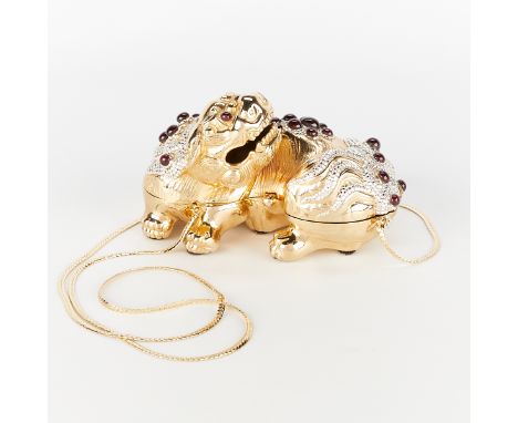
Judith Leiber Couture, United States. Chinese Ming foo dog gold-tone metal minaudiere clutch bag. With applied Swarovski crystals and cabochon garnets. The interior with gold leather, label, and gold-tone metal shoulder strap.Height: 3 3/4 in x width: 6 in x depth: 4 in. />Condition: Please contact us for a detailed condition report. Please note that the lack of a condition statement does not imply perfect condition. Email condition@revereauctions.com with any condition questions.
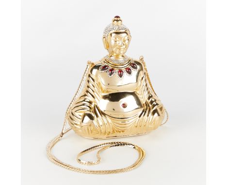
Lot 215
Judith Leiber Couture, United States. Buddha gold-tone metal minaudiere clutch bag. With applied Swarovski crystals and cabochon garnets. The interior with gold leather, label, and gold-tone metal shoulder strap. Also included is a small Judith Leiber mirror.Height: 5 3/4 in x width: 4 1/4 in x depth: 2 3/4 in. />Condition: Please contact us for a detailed condition report. Please note that the lack of a condition statement does not imply perfect condition. Email condition@revereauctions.com with any condition questions.

Lot 217
Judith Leiber Couture, United States. Gold-tone metal sleeping cat minaudiere clutch bag, ca. 1970s. With applied Swarovski crystals in white and black. The interior with gold leather, label, and gold-tone metal comb.Height: 3 in x width: 6 in x depth: 4 in. />Condition: Approximately 1 crystal loss. Dust accumulation at the cats neck and near bow and in bow and near the leg. Light wear to the metal including minor scratches and scuffs. Light wear including scuffs and scratches and loss of color to the leather at the bottom. Small dislocation to the field of crystals at lower back above hinges. Red mark on the gold tone metal near cat's right front paw. Faint pink mark near the metal label in the interior. Discoloration to the gold leather lining at the upper center back.
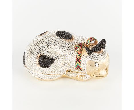
Lot 218
Judith Leiber Couture, United States. Gold-tone metal sleeping cat minaudiere clutch bag, ca. 1970s. The body with applied Swarovski crystals in multi-colored clear with black spots. The bow with black, yellow, red, and green crystals. The interior with gold leather, label, and gold-tone metal comb.Height: 2 in x width: 6 in x depth: 3 3/4 in. />Condition: Dust accumulation at the cat's neck, near the bow, in the bow, and near the leg Light wear to the metal including minor scratches and scuffs. Slight discoloration to the metal at the center of the cat's ears. Light wear including scuffs and scratches and loss of color to the leather at the bottom. Discoloration to the inside leather lining at the upper left quadrant. Approximately 5 crystal losses.

![Judith Brown (1932-1992) Twee eenden inkt en aquarel, gesign. r.o., '60, 35 x 28 cm. [1]](https://cdn.globalauctionplatform.com/fd2f3b83-b953-4959-8752-b0a400c1c2a3/2d3870b0-8be5-4c07-9969-b0a500b9b3d5/468x382.jpg)
Lot 592
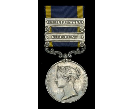
Punjab 1848-49, 2 clasps, Chilianwala, Goojerat (Bombardier George Seffert 3rd. Troop 2d. Bn. H.A.) officially re-engraved naming, edge bruising, nearly very fine £140-£180 --- George Seffert was born in St. Pancras, London in 1824. A cabinet maker by trade, he attested at Marlborough Street for the Bengal Artillery on 21 February 1845, sailing to India aboard the Judith Allan six months later. Promoted Bombardier on 19 September 1848, the muster book taken on 1 September 1849 at Dum Dum shows him serving with 3/2 Bengal Horse Artillery. Further advanced Corporal, his career stalled somewhat in the autumn of 1851 when he was Court Martialed and reduced to Gunner. The muster for 1857-58, taken at Meerut on 1 September 1858, records Seffert with 1st Troop, 2nd Brigade. Returned to Corporal 10 April 1860, history repeated itself and he was reduced in the ranks once again, transferring as Gunner to the Royal Artillery upon release from confinement on 20 February 1861. Discharged at Netley on 18 November 1863 after 20 years as a soldier, his medical report states debility ‘from age and service’. Sold with copied research.
![GEOFFREY CLARKE R.A. [1924-2014]. Nature and Time, 1999. bronze, edition of 42, cast by Nautilus Foundry. 8 cm high. Provenan](https://cdn.globalauctionplatform.com/58a4d54b-f0aa-4514-a4b4-b07a0115c6a6/2c24d8c8-2e7e-4071-9093-b07a0119907b/468x382.jpg)
Lot 162
GEOFFREY CLARKE R.A. [1924-2014]. Nature and Time, 1999. bronze, edition of 42, cast by Nautilus Foundry. 8 cm high. Provenance: the artist; private collection, UK. Literature: 'Geoffrey Clarke', catalogue raisonne, Judith Legrove, Lund Humphries, p. 291 [illustrated]. [very good condition]. Buyers premium 20% + vat payable.
![GEOFFREY CLARKE R.A. [1924-2014]. Pyramus and Thisbe, 1985. bronze, edition of 38. 9 cm high. Provenance: the artist; private](https://cdn.globalauctionplatform.com/58a4d54b-f0aa-4514-a4b4-b07a0115c6a6/ccfcca1e-171d-4ff7-84bb-b07a0119936f/468x382.jpg)
Lot 163
GEOFFREY CLARKE R.A. [1924-2014]. Pyramus and Thisbe, 1985. bronze, edition of 38. 9 cm high. Provenance: the artist; private collection, UK. Literature: 'Geoffrey Clarke', catalogue raisonne, Judith Legrove, Lund Humphries, p. 291 [illustrated].. [very good condition]. Buyers premium 20% + vat payable. ARR 4%.
![GEOFFREY CLARKE R.A. [1924-2014]. Cross, c. 1975. aluminium relief, unique; signed on the reverse. 8 cm high. Provenance: The](https://cdn.globalauctionplatform.com/58a4d54b-f0aa-4514-a4b4-b07a0115c6a6/24c5caa0-fac4-450c-9e0b-b07a01199639/468x382.jpg)
Lot 164
GEOFFREY CLARKE R.A. [1924-2014]. Cross, c. 1975. aluminium relief, unique; signed on the reverse. 8 cm high. Provenance: The artist; private collection, UK. Literature: 'Geoffrey Clarke', catalogue raisonne, Judith Legrove, Lund Humphries, p. 289 [illustrated]. [very good condition - some slight surface dust]. Buyers premium 20% + vat payable. ARR 4%.

Lot 242
COLLECTION OF ART REFERENCE BOOKS ON ASIAN WORKS OF ART 中國藝術參考書籍(共四十六本)含玉器、雜項、考古等研究、重要館藏及展覽圖錄等著作 including art reference books for jade, works or art, archaeology, musuem and exhibition catalogues, in total 46 publications.12th Annual New York Arts of Pacific Asia Show, New York, 2004Asian Art Museum: Selected articles from Orientations, Hong Kong: Orientations Magazine Ltd., 1999Bonhams: Fine Asian Art, London: Bonhams, 2005Chinese Buddhist Sculpture: from the collection of C.R. Moss O.B.E. and other properties (catalogue), Oriental Arts, 2000Chinese Jade Animals, Hong Kong: Urban Council of Hong Kong, 1997Chinese Jade: Selected articles from Orientations 1983-1996, Hong Kong: Orientations Magazine Ltd., 1997Christie's: Fine Chinese Ceramics and Works of Art Including Export Art, 2008Denwood, Philip (ed.), The Arts of the Eurasian Steppelands: a Colloquy held 27-29 June 1977 (Colloquies on Art & Archaeology in Asia No.7), London: School of Oriental and African Studies, 1977Fong, Wen and Watt, James C.Y., Possessing the Past: Treasures from the National Palace Museum, Taipei, New York: The Metropolitan Museum of Art, 1996Forsyth, Angus and McElney, Brian, Jades from China, Bath: The Museum of East Asian Art, 1994Hansford, S. Howard, Chinese Carved Jades, London: Faber and Faber Limited, 1968Howard, David S., A Tale of Three Cities: Canton, Shanghai & Hong Kong, London: Sotheby's, 1997Juliano, Annette L., Lerner, Judith A., Alram, Michael, Monks and Merchants: Silk Road Treasures from Northwest China, New York: Harry N. Abrams, 2001Kerr, Rose, Chinese Art and Design: The T.T. Tsui Gallery of Chinese Art, London: Victoria and Albert Museum, 1991Knapston Rasti catalogue Nov 05Knapston Rasti catalogue Nov 07Leiper, Susan, Precious Cargo: Scots and the China Trade, Edinburgh: National Museums of Scotland, 1997Lin, James C.S. (ed.), The Search for Immortality: Tomb Treasures of Han China, New Haven: Yale University Press, 2012Lu, Wenbao, Jades of the Liangzhu Culture, Hong Kong: The Chinese University of Hong Kong Art, 1998Michaelson, Carol, Gilded Dragons: Buried Treasures from China's Golden Ages, London: The British Museum, 1999Ming, Yu, Chinese Jade, Cambridge: Cambridge University Press, 2011Morgan, Michell (ed.), The Museum of East Asian Art Journal Volume V, Bath: The Museum of East Asian Art, 1999Morgan, Michelle, 100 Treasures: The Museum of East Asian Art, Bath: The Museum of East Asian Art, 2000National Museums of Scotland, Ming: The Golden Empire, Edinburgh: National Museums of Scotland, 2014Oriental Art Vol 44 No. 2 (1998)Oriental Art Vol 45 No. 1 (1999)Peterson, Harold (ed.), Chinese Jades: Archaic and Modern from the Minneapolis Institute of Arts, Rutland: Charles E. Tuttle Company, 1977Pirazzoli-t'Serstevens, Michele, The Han Dynasty, New York: Rizzoli International Publications, 1982Portal, Jane and Duan, Qingbo (ed.) The First Emperor: China's Terracotta Army, London: The British Museum, 2007Rawson, Jessica (ed.), Treasures from Shanghai: Ancient Chinese Bronzes and Jades, London: The British Museum, 2009Rawson, Jessica, Chinese Jade from the Neolithic to the Qing, London: The British Museum, 2002Rawson, Jessica, Chinese Ornament: The Lotus and the Dragon, London: The British Museum, 1984Schafer, Edward H., The Golden Peaches of Samarkand: A Study of Tang Exotics, Berkeley: The University of California Press, 1985Scott, Rosemary E., Chinese Jades (Colloquies on Art & Archaeology in Asia No.18), London: School of Oriental and African Studies, 1997Shanghai Museum Chinese Painting Gallery, Shanghai: Shanghai MuseumSickman, Laurence and Soper, Alexander, The Art and Architecture of China, New Haven: Yale University Press, 1992So, Jenny F. and Bunker, Emma C., Traders and Raiders on China's Northern Frontier, Washington: Smithsonian Institution, 1995The International Asian Art Fair, 2004Watson, William, The Arts of China to AD 900, New Haven: Yale University Press, 1995Watson, William, The Genius of China: An exhibition of archaeological finds of the People's Republic of China, London: Times Newspapers Ltd., 1973Watt, James C.Y. (et al.), China: Dawn of a Golden Age, 200-750 AD, New York: The Metropolitan Museum of Art, 2004Whitfield, Roderick (ed.), The Problem of Meaning in Early Chinese Ritual Bronzes (Colloquies on Art & Archaeology in Asia No.15), London: School of Oriental and African Studies, 1993Wilson, Ming, Chinese Jades (Victoria & Albert Museum Far Eastern Series), London: V&A Publications, 2004Yang, Xiaoneng (ed.), New Perspectives on China's Past: Chinese Archaeology in the Twentieth Century: Cultures and Civilizations Reconsidered (Vol 1), New Haven: Yale University Press, 2004Yang, Xiaoneng (ed.), New Perspectives on China's Past: Chinese Archaeology in the Twentieth Century: Major Archaeological Discoveries in Twentieth Century China (Vol 2), New Haven: Yale University Press, 2004Zhang, Hongxing, The Qianlong Emperor: Treasures from the Forbidden City, Edinburgh: National Museums of Scotland, 2002 Provenance:Provenance: Private Scottish collection, North Berwick, has been collecting Asian ceramics for 25 years. Note: Please note this lot will be offered with no reserve. 本拍品不設底價
Lot 1140
Sir Harry Garner. 'Oriental Blue and White'. Sir Harry Garner, 'Chinese and Japanese Cloisonne Enamels'; Rupert Faulkner, Tea East & West; M.M. Kaye, 'The Golden Calm'; Judith Moorhouse, 'Collecting Oriental Antiques'; Lin Yutang, 'Imperial Peking' and Field Museum of Natural History, Department of Anthropology, Chicago, 1924 leaflet, 'Tobacco and Its Use in Asia'. (7) Maurice Jenkins (1933-2022). North Cornwall collector. Maurice was a lifetime collector and started in the 1950s. He opened a shop in Liskeard in the 1970s called Canon Hill Antiques. He visited a number of Middle Eastern countries in his lifetime including Egypt in the late 1970's when his interest in Islamic and Asian antiques began. He was a man with an eye for quality and a love of antiques, history and travel who purchased privately and at auction over the decades. Over a lifetime of purchasing privately and at auction, he created an eclectic ensemble of collections reflecting his interests. He died a few weeks before his 90th birthday and was still buying until that time.

Lot 67
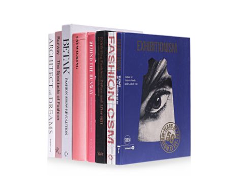
FASHION BOOKS - RUNWAYS & EXHIBITIONS COMPRISING: Architect of Dreams: Olivier Massart - La Mode en Images, Jéromine Savignon and Gilles de Bure, Assouline Publishing, New York 2012 Behind the Runway: Backstage Access to Fashion’s Biggest Shows, Matt Lever, Roads Publishing, Dublin 2016 Betak: Fashion Show Revolution, Alexandre-Camille Removille and William Norwich et al (eds.), Phaidon Press Limited, London and New York 2017 Catwalking: Photographs by Chris Moore, Alexander Fury, Laurence King Publishing Ltd, London 2017 Exhibiting Fashion: Before and After 1971, Judith Clark, Amy de la Haye, and Jeffrey Horsley, Yale University Press, New Haven and London 2014 Exhibitionism: 50 Years of the Museum at FIT, Valerie Steele and Colleen Hill (eds.), Skira editors S.p.A., Milano 2018 Fashion Central Saint Martins, Cally Blackman and Hywel Davies (eds.), Thames & Hudson Ltd, London 2019 Runway: The Spectacle of Fashion, Alix Browne, Rizzoli International Publications, New York 2016 (8) Condition: For a condition report or further images please email hello@hotlotz.com at least 48 hours prior to the closing date of the auction. This is an auction of preowned and antique items. Many items are of an age or nature which precludes their being in perfect condition and you should expect general wear and tear commensurate with age and use. We strongly advise you to examine items before you bid. Condition reports are provided as a goodwill gesture and are our general assessment of damage and restoration. Whilst care is taken in their drafting, they are for guidance only. We will not be held responsible for oversights concerning damage or restoration.
Lot 60
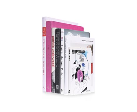
FASHION BOOKS - HATS & MILLINERY COMPRISING; Hats by Madame Paulette: Paris Milliner Extraodinaire, Annie Schneider, Thames & Hudson Ltd, London 2014 “When Philip met Isabella”, Philip Treacy, Assouline Publishing, New York 2002 Patricia Underwood: The Way You Wear Your Hat, Jeffrey Banks and Doris de la Chapelle, Rizzoli International Publications Inc, New York 2015 Philip Treacy by Kevin Davies, Kevin Davies, Phaidon Press Limited, London 2013 Philip Treacy: Hat Designer, Marion Hume and Philip Treacy, Rizzoli International Publications Inc., New York 2015 Stephen Jones: Souvenirs, Susannah Frankel and Stephen Jones, Rizzoli International Publications Inc., New York 2016 Stephen Jones & The Accent of Fashion, Hamish Bowles and Judith Clark et al, Lannoo Publishers and ACC Editions, Tielt and Suffolk, 2010 (7) Condition: For a condition report or further images please email hello@hotlotz.com at least 48 hours prior to the closing date of the auction. This is an auction of preowned and antique items. Many items are of an age or nature which precludes their being in perfect condition and you should expect general wear and tear commensurate with age and use. We strongly advise you to examine items before you bid. Condition reports are provided as a goodwill gesture and are our general assessment of damage and restoration. Whilst care is taken in their drafting, they are for guidance only. We will not be held responsible for oversights concerning damage or restoration.
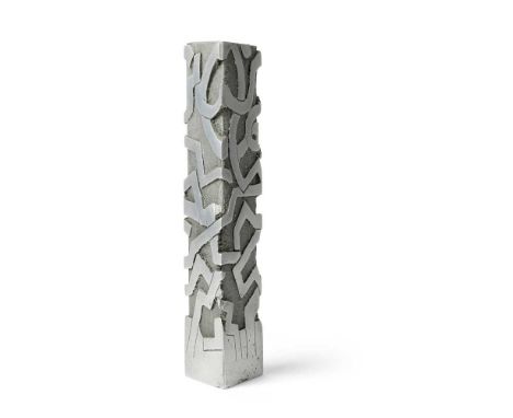
Lot 191
§ Geoffrey Clarke R.A. (British 1924-2014) Column, 1993 (LeGrove S692) stamped artist's mark, aluminium Dimensions:26cm high (10 1/8in high) Provenance:ProvenancePrivate Collection, UK. ExhibitedChappel Galleries, Chappel, Geoffrey Clarke RA - Latest Work: Sculpture, Paintings & Drawings, 29 October - 26 November 1994. LiteratureLeGrove, Judith, Geoffrey Clarke Sculptor: Catalogue Raisonné, London: Pangolin and Lund Humphries, 2017, p.209, S692, illustrated. Note: Geoffrey Clarke: Intimate yet MonumentalThe works by Geoffrey Clarke offered here date from 1951 to 1993, spanning over forty years of his long and prolific career and representing a range of phases within his practice. What they have in common, however, is an intimate yet monumental character in which sculptures as modestly-sized as 10 centimetres high encapsulate a power and presence more readily associated with larger works.Head I of 1951 comes from an early series and was made whilst Clarke was studying at the Royal College of Art in London. Worked in iron, it reveals an exploration of Cubism and Surrealism with a frank appreciation of the materiality of his medium. Clarke graduated the following year, with his talent being immediately recognised with nothing less than his inclusion in the New Aspects of British Sculpture exhibition in the British Pavilion of the 26th Venice Biennale that summer. Clarke’s work was shown alongside that of seven other sculptors, namely Robert Adams, Kenneth Armitage, Reg Butler, Lynn Chadwick, Bernard Medows, Eduardo Paolozzi and William Turnbull. He was therefore positioned within the vanguard of post-war British sculpture and his career was launched to spectacular effect.Maquette for Sainsbury Sculpture Competition of 1965 fast forwards us to the mid-1960s, Clarke’s interest in public commissions and the associated use of cast aluminium; Ann Elliott has described the sandbox he built for this purpose in his studio foundry in Suffolk in 1954 (see Ann Elliott, ‘Clarke, Geoffrey Cyril Petts’, Oxford Dictionary of National Biography, on-line entry accessed 19/9/23). A totemic central element is crowned with a spiralling form whose upwards thrust is akin to organic growth. The varied surface treatment of the two parts is key to expressing the contrast between their presentations of mass and movement.Torrii Prone (i) and Toriio also date from 1965. As Peter Black has explained ‘The title ‘Torii’ applied to this series of sculptures derives from the ceremonial gateways to Japanese Shinto shrines. The essence of these works is the contrast between the inanimate slab of metal and the organic structures that bud and grow from the top.’ (Peter Black, Geoffrey Clarke: Symbols for Man, Sculptures and Graphic Work 1949-94, Lund Humphries, London, 1994, p.70). This series encompassed works based on vertical and horizontal formats in which Clarke explored a softened geometry combined with a curvaceous and rhythmic solidity. It is interesting to compare the organicism of these sculptures with Adams’s contemporary Vertical Form No. 1, an austere and imposing bronzed steel work made on a human scale and the suppleness of Bernard Meadows’ Pointing Figure of two years later.The Sea at Aldeburgh of 1978 is a particularly personal work. Clarke had close links to the Suffolk seaside town, not least owning its Martello Tower between 1967 and 1971; the tower and its surrounding topography fed into his work for some time. Made from mixed media applied to a small rectangle of polystyrene – more readily associated in Clarke’s practice with carving and the casting process – it is a simplified sea view in which the composition is split almost equally between sky and sea.Column and Pyramid both date from 1993. By this point in his career, Clarke had brought together formerly disparate elements to create sculptural planes enlivened by rich, deep-relief patterning which encases (or reveals) a raw core. Both works refer to significant architectural structures, whose power is yet retained in their modest scale.Clarke’s 70th birthday in 1994 was marked by several exhibitions, including a solo show at Yorkshire Sculpture Park which featured a cast of Head I on its catalogue cover. Ever interested in new materials, Clarke made his first work in wood in 1996 and, with an eye to his legacy, donated his archive to Leeds Museums and Galleries in 2012, two years before his death.
Lot 193
§ Geoffrey Clarke R.A. (British 1924-2014) Maquette for Sainsbury Sculpture Competition (Climber), 1965 (LeGrove S260a) stamped artist's mark, aluminium Dimensions:26.6cm high (10 1/2in high) Provenance:ProvenancePrivate Collection, UK.LiteratureLeGrove, Judith, Geoffrey Clarke Sculptor: Catalogue Raisonné, London: Pangolin and Lund Humphries, 2017, p.100, S260a, illustrated. Note: This is one of a series of maquettes for a sculpture submitted for a competition for a site between the King's Road, Chelsea and a new branch of Sainsbury's. This example was later titled Climber. Geoffrey Clarke: Intimate yet MonumentalThe works by Geoffrey Clarke offered here date from 1951 to 1993, spanning over forty years of his long and prolific career and representing a range of phases within his practice. What they have in common, however, is an intimate yet monumental character in which sculptures as modestly-sized as 10 centimetres high encapsulate a power and presence more readily associated with larger works.Head I of 1951 comes from an early series and was made whilst Clarke was studying at the Royal College of Art in London. Worked in iron, it reveals an exploration of Cubism and Surrealism with a frank appreciation of the materiality of his medium. Clarke graduated the following year, with his talent being immediately recognised with nothing less than his inclusion in the New Aspects of British Sculpture exhibition in the British Pavilion of the 26th Venice Biennale that summer. Clarke’s work was shown alongside that of seven other sculptors, namely Robert Adams, Kenneth Armitage, Reg Butler, Lynn Chadwick, Bernard Medows, Eduardo Paolozzi and William Turnbull. He was therefore positioned within the vanguard of post-war British sculpture and his career was launched to spectacular effect.Maquette for Sainsbury Sculpture Competition of 1965 fast forwards us to the mid-1960s, Clarke’s interest in public commissions and the associated use of cast aluminium; Ann Elliott has described the sandbox he built for this purpose in his studio foundry in Suffolk in 1954 (see Ann Elliott, ‘Clarke, Geoffrey Cyril Petts’, Oxford Dictionary of National Biography, on-line entry accessed 19/9/23). A totemic central element is crowned with a spiralling form whose upwards thrust is akin to organic growth. The varied surface treatment of the two parts is key to expressing the contrast between their presentations of mass and movement.Torrii Prone (i) and Toriio also date from 1965. As Peter Black has explained ‘The title ‘Torii’ applied to this series of sculptures derives from the ceremonial gateways to Japanese Shinto shrines. The essence of these works is the contrast between the inanimate slab of metal and the organic structures that bud and grow from the top.’ (Peter Black, Geoffrey Clarke: Symbols for Man, Sculptures and Graphic Work 1949-94, Lund Humphries, London, 1994, p.70). This series encompassed works based on vertical and horizontal formats in which Clarke explored a softened geometry combined with a curvaceous and rhythmic solidity. It is interesting to compare the organicism of these sculptures with Adams’s contemporary Vertical Form No. 1, an austere and imposing bronzed steel work made on a human scale and the suppleness of Bernard Meadows’ Pointing Figure of two years later.The Sea at Aldeburgh of 1978 is a particularly personal work. Clarke had close links to the Suffolk seaside town, not least owning its Martello Tower between 1967 and 1971; the tower and its surrounding topography fed into his work for some time. Made from mixed media applied to a small rectangle of polystyrene – more readily associated in Clarke’s practice with carving and the casting process – it is a simplified sea view in which the composition is split almost equally between sky and sea.Column and Pyramid both date from 1993. By this point in his career, Clarke had brought together formerly disparate elements to create sculptural planes enlivened by rich, deep-relief patterning which encases (or reveals) a raw core. Both works refer to significant architectural structures, whose power is yet retained in their modest scale.Clarke’s 70th birthday in 1994 was marked by several exhibitions, including a solo show at Yorkshire Sculpture Park which featured a cast of Head I on its catalogue cover. Ever interested in new materials, Clarke made his first work in wood in 1996 and, with an eye to his legacy, donated his archive to Leeds Museums and Galleries in 2012, two years before his death.
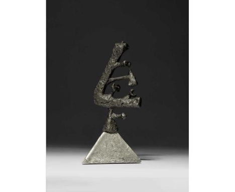
Lot 188
§ Geoffrey Clarke R.A. (British 1924-2014) Head I, 1951 (LeGrove S36) iron on aluminium, unique Dimensions:18cm high (7in high) Provenance:ProvenancePrivate Collection, UK.ExhibitedGimpel Fils, London, Geoffrey Clarke, Peter Potworowski, March - April 1952, no.41;Redfern Gallery, London, Geoffrey Clarke: Recent Sculptures, March - April 1965, no.49;Yorkshire Sculpture Park, Wakefield, Geoffrey Clarke RA: Sculpture and Works on Paper 1950-1994, April-June1994, illustrated on the cover.LiteratureLeGrove, Judith, Geoffrey Clarke Sculptor: Catalogue Raisonné, London: Pangolin and Lund Humphries, 2017, p.29, S36, illustrated. Note: A cross on the top was missing by 1965 and has never been restored. Geoffrey Clarke: Intimate yet MonumentalThe works by Geoffrey Clarke offered here date from 1951 to 1993, spanning over forty years of his long and prolific career and representing a range of phases within his practice. What they have in common, however, is an intimate yet monumental character in which sculptures as modestly-sized as 10 centimetres high encapsulate a power and presence more readily associated with larger works.Head I of 1951 comes from an early series and was made whilst Clarke was studying at the Royal College of Art in London. Worked in iron, it reveals an exploration of Cubism and Surrealism with a frank appreciation of the materiality of his medium. Clarke graduated the following year, with his talent being immediately recognised with nothing less than his inclusion in the New Aspects of British Sculpture exhibition in the British Pavilion of the 26th Venice Biennale that summer. Clarke’s work was shown alongside that of seven other sculptors, namely Robert Adams, Kenneth Armitage, Reg Butler, Lynn Chadwick, Bernard Medows, Eduardo Paolozzi and William Turnbull. He was therefore positioned within the vanguard of post-war British sculpture and his career was launched to spectacular effect.Maquette for Sainsbury Sculpture Competition of 1965 fast forwards us to the mid-1960s, Clarke’s interest in public commissions and the associated use of cast aluminium; Ann Elliott has described the sandbox he built for this purpose in his studio foundry in Suffolk in 1954 (see Ann Elliott, ‘Clarke, Geoffrey Cyril Petts’, Oxford Dictionary of National Biography, on-line entry accessed 19/9/23). A totemic central element is crowned with a spiralling form whose upwards thrust is akin to organic growth. The varied surface treatment of the two parts is key to expressing the contrast between their presentations of mass and movement.Torrii Prone (i) and Toriio also date from 1965. As Peter Black has explained ‘The title ‘Torii’ applied to this series of sculptures derives from the ceremonial gateways to Japanese Shinto shrines. The essence of these works is the contrast between the inanimate slab of metal and the organic structures that bud and grow from the top.’ (Peter Black, Geoffrey Clarke: Symbols for Man, Sculptures and Graphic Work 1949-94, Lund Humphries, London, 1994, p.70). This series encompassed works based on vertical and horizontal formats in which Clarke explored a softened geometry combined with a curvaceous and rhythmic solidity. It is interesting to compare the organicism of these sculptures with Adams’s contemporary Vertical Form No. 1, an austere and imposing bronzed steel work made on a human scale and the suppleness of Bernard Meadows’ Pointing Figure of two years later.The Sea at Aldeburgh of 1978 is a particularly personal work. Clarke had close links to the Suffolk seaside town, not least owning its Martello Tower between 1967 and 1971; the tower and its surrounding topography fed into his work for some time. Made from mixed media applied to a small rectangle of polystyrene – more readily associated in Clarke’s practice with carving and the casting process – it is a simplified sea view in which the composition is split almost equally between sky and sea.Column and Pyramid both date from 1993. By this point in his career, Clarke had brought together formerly disparate elements to create sculptural planes enlivened by rich, deep-relief patterning which encases (or reveals) a raw core. Both works refer to significant architectural structures, whose power is yet retained in their modest scale.Clarke’s 70th birthday in 1994 was marked by several exhibitions, including a solo show at Yorkshire Sculpture Park which featured a cast of Head I on its catalogue cover. Ever interested in new materials, Clarke made his first work in wood in 1996 and, with an eye to his legacy, donated his archive to Leeds Museums and Galleries in 2012, two years before his death.
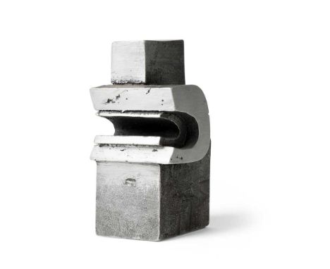
Lot 190
§ Geoffrey Clarke R.A. (British 1924-2014) Toriio, 1965 (LeGrove S294b) stamped with the artist's mark, numbered 3/10 and 533 and dated 65, aluminium Dimensions:15.2cm high, 7.5cm wide (6in high, 3in wide) Provenance:ProvenancePurchased from Whitford Fine Art, London in 2002 by the current owner.LiteratureLeGrove, Judith, Geoffrey Clarke Sculptor: Catalogue Raisonné, London: Pangolin and Lund Humphries, 2017, p.110, S294b, illustrated. Note: Geoffrey Clarke: Intimate yet MonumentalThe works by Geoffrey Clarke offered here date from 1951 to 1993, spanning over forty years of his long and prolific career and representing a range of phases within his practice. What they have in common, however, is an intimate yet monumental character in which sculptures as modestly-sized as 10 centimetres high encapsulate a power and presence more readily associated with larger works.Head I of 1951 comes from an early series and was made whilst Clarke was studying at the Royal College of Art in London. Worked in iron, it reveals an exploration of Cubism and Surrealism with a frank appreciation of the materiality of his medium. Clarke graduated the following year, with his talent being immediately recognised with nothing less than his inclusion in the New Aspects of British Sculpture exhibition in the British Pavilion of the 26th Venice Biennale that summer. Clarke’s work was shown alongside that of seven other sculptors, namely Robert Adams, Kenneth Armitage, Reg Butler, Lynn Chadwick, Bernard Medows, Eduardo Paolozzi and William Turnbull. He was therefore positioned within the vanguard of post-war British sculpture and his career was launched to spectacular effect.Maquette for Sainsbury Sculpture Competition of 1965 fast forwards us to the mid-1960s, Clarke’s interest in public commissions and the associated use of cast aluminium; Ann Elliott has described the sandbox he built for this purpose in his studio foundry in Suffolk in 1954 (see Ann Elliott, ‘Clarke, Geoffrey Cyril Petts’, Oxford Dictionary of National Biography, on-line entry accessed 19/9/23). A totemic central element is crowned with a spiralling form whose upwards thrust is akin to organic growth. The varied surface treatment of the two parts is key to expressing the contrast between their presentations of mass and movement.Torrii Prone (i) and Toriio also date from 1965. As Peter Black has explained ‘The title ‘Torii’ applied to this series of sculptures derives from the ceremonial gateways to Japanese Shinto shrines. The essence of these works is the contrast between the inanimate slab of metal and the organic structures that bud and grow from the top.’ (Peter Black, Geoffrey Clarke: Symbols for Man, Sculptures and Graphic Work 1949-94, Lund Humphries, London, 1994, p.70). This series encompassed works based on vertical and horizontal formats in which Clarke explored a softened geometry combined with a curvaceous and rhythmic solidity. It is interesting to compare the organicism of these sculptures with Adams’s contemporary Vertical Form No. 1, an austere and imposing bronzed steel work made on a human scale and the suppleness of Bernard Meadows’ Pointing Figure of two years later.The Sea at Aldeburgh of 1978 is a particularly personal work. Clarke had close links to the Suffolk seaside town, not least owning its Martello Tower between 1967 and 1971; the tower and its surrounding topography fed into his work for some time. Made from mixed media applied to a small rectangle of polystyrene – more readily associated in Clarke’s practice with carving and the casting process – it is a simplified sea view in which the composition is split almost equally between sky and sea.Column and Pyramid both date from 1993. By this point in his career, Clarke had brought together formerly disparate elements to create sculptural planes enlivened by rich, deep-relief patterning which encases (or reveals) a raw core. Both works refer to significant architectural structures, whose power is yet retained in their modest scale.Clarke’s 70th birthday in 1994 was marked by several exhibitions, including a solo show at Yorkshire Sculpture Park which featured a cast of Head I on its catalogue cover. Ever interested in new materials, Clarke made his first work in wood in 1996 and, with an eye to his legacy, donated his archive to Leeds Museums and Galleries in 2012, two years before his death.
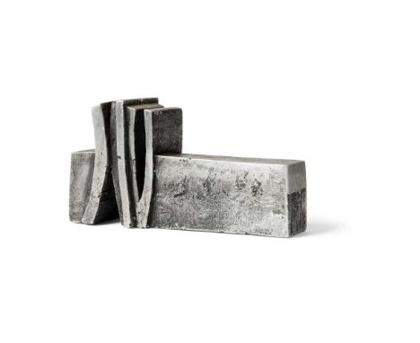
Lot 189
§ Geoffrey Clarke R.A. (British 1924-2014) Torii Prone One (i), 1965 (LeGrove S276) stamped artist's mark, numbered 1/10 and 512 and dated 65, aluminium Dimensions:10cm high, 19.5cm wide (4in high, 7 5/8in wide) Provenance:ProvenancePurchased from Whitford Fine Art, London in 2002 by the current owner.LiteratureLeGrove, Judith, Geoffrey Clarke Sculptor: Catalogue Raisonné, London: Pangolin and Lund Humphries, 2017, p.106, S276, illustrated. Note: Geoffrey Clarke: Intimate yet MonumentalThe works by Geoffrey Clarke offered here date from 1951 to 1993, spanning over forty years of his long and prolific career and representing a range of phases within his practice. What they have in common, however, is an intimate yet monumental character in which sculptures as modestly-sized as 10 centimetres high encapsulate a power and presence more readily associated with larger works.Head I of 1951 comes from an early series and was made whilst Clarke was studying at the Royal College of Art in London. Worked in iron, it reveals an exploration of Cubism and Surrealism with a frank appreciation of the materiality of his medium. Clarke graduated the following year, with his talent being immediately recognised with nothing less than his inclusion in the New Aspects of British Sculpture exhibition in the British Pavilion of the 26th Venice Biennale that summer. Clarke’s work was shown alongside that of seven other sculptors, namely Robert Adams, Kenneth Armitage, Reg Butler, Lynn Chadwick, Bernard Medows, Eduardo Paolozzi and William Turnbull. He was therefore positioned within the vanguard of post-war British sculpture and his career was launched to spectacular effect.Maquette for Sainsbury Sculpture Competition of 1965 fast forwards us to the mid-1960s, Clarke’s interest in public commissions and the associated use of cast aluminium; Ann Elliott has described the sandbox he built for this purpose in his studio foundry in Suffolk in 1954 (see Ann Elliott, ‘Clarke, Geoffrey Cyril Petts’, Oxford Dictionary of National Biography, on-line entry accessed 19/9/23). A totemic central element is crowned with a spiralling form whose upwards thrust is akin to organic growth. The varied surface treatment of the two parts is key to expressing the contrast between their presentations of mass and movement.Torrii Prone (i) and Toriio also date from 1965. As Peter Black has explained ‘The title ‘Torii’ applied to this series of sculptures derives from the ceremonial gateways to Japanese Shinto shrines. The essence of these works is the contrast between the inanimate slab of metal and the organic structures that bud and grow from the top.’ (Peter Black, Geoffrey Clarke: Symbols for Man, Sculptures and Graphic Work 1949-94, Lund Humphries, London, 1994, p.70). This series encompassed works based on vertical and horizontal formats in which Clarke explored a softened geometry combined with a curvaceous and rhythmic solidity. It is interesting to compare the organicism of these sculptures with Adams’s contemporary Vertical Form No. 1, an austere and imposing bronzed steel work made on a human scale and the suppleness of Bernard Meadows’ Pointing Figure of two years later.The Sea at Aldeburgh of 1978 is a particularly personal work. Clarke had close links to the Suffolk seaside town, not least owning its Martello Tower between 1967 and 1971; the tower and its surrounding topography fed into his work for some time. Made from mixed media applied to a small rectangle of polystyrene – more readily associated in Clarke’s practice with carving and the casting process – it is a simplified sea view in which the composition is split almost equally between sky and sea.Column and Pyramid both date from 1993. By this point in his career, Clarke had brought together formerly disparate elements to create sculptural planes enlivened by rich, deep-relief patterning which encases (or reveals) a raw core. Both works refer to significant architectural structures, whose power is yet retained in their modest scale.Clarke’s 70th birthday in 1994 was marked by several exhibitions, including a solo show at Yorkshire Sculpture Park which featured a cast of Head I on its catalogue cover. Ever interested in new materials, Clarke made his first work in wood in 1996 and, with an eye to his legacy, donated his archive to Leeds Museums and Galleries in 2012, two years before his death.
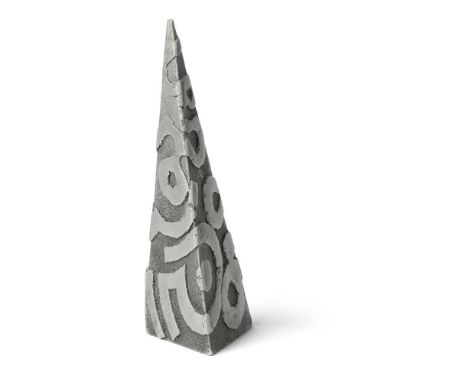
Lot 192
§ Geoffrey Clarke R.A. (British 1924-2014) Pyramid, 1993 (LeGrove S703) stamped artist's mark, aluminium Dimensions:20.5cm high (8in high) Provenance:ProvenancePrivate Collection, UK.ExhibitedThe Fine Art Society Limited, London, Geoffrey Clarke: Sculpture, Constructions and Works on Paper 1949-2000, 9 October - 2 November 2000, no.75.LiteratureLeGrove, Judith, Geoffrey Clarke Sculptor: Catalogue Raisonné, London: Pangolin and Lund Humphries, 2017, p.211, SS703, illustrated. Note: Geoffrey Clarke: Intimate yet MonumentalThe works by Geoffrey Clarke offered here date from 1951 to 1993, spanning over forty years of his long and prolific career and representing a range of phases within his practice. What they have in common, however, is an intimate yet monumental character in which sculptures as modestly-sized as 10 centimetres high encapsulate a power and presence more readily associated with larger works.Head I of 1951 comes from an early series and was made whilst Clarke was studying at the Royal College of Art in London. Worked in iron, it reveals an exploration of Cubism and Surrealism with a frank appreciation of the materiality of his medium. Clarke graduated the following year, with his talent being immediately recognised with nothing less than his inclusion in the New Aspects of British Sculpture exhibition in the British Pavilion of the 26th Venice Biennale that summer. Clarke’s work was shown alongside that of seven other sculptors, namely Robert Adams, Kenneth Armitage, Reg Butler, Lynn Chadwick, Bernard Medows, Eduardo Paolozzi and William Turnbull. He was therefore positioned within the vanguard of post-war British sculpture and his career was launched to spectacular effect.Maquette for Sainsbury Sculpture Competition of 1965 fast forwards us to the mid-1960s, Clarke’s interest in public commissions and the associated use of cast aluminium; Ann Elliott has described the sandbox he built for this purpose in his studio foundry in Suffolk in 1954 (see Ann Elliott, ‘Clarke, Geoffrey Cyril Petts’, Oxford Dictionary of National Biography, on-line entry accessed 19/9/23). A totemic central element is crowned with a spiralling form whose upwards thrust is akin to organic growth. The varied surface treatment of the two parts is key to expressing the contrast between their presentations of mass and movement.Torrii Prone (i) and Toriio also date from 1965. As Peter Black has explained ‘The title ‘Torii’ applied to this series of sculptures derives from the ceremonial gateways to Japanese Shinto shrines. The essence of these works is the contrast between the inanimate slab of metal and the organic structures that bud and grow from the top.’ (Peter Black, Geoffrey Clarke: Symbols for Man, Sculptures and Graphic Work 1949-94, Lund Humphries, London, 1994, p.70). This series encompassed works based on vertical and horizontal formats in which Clarke explored a softened geometry combined with a curvaceous and rhythmic solidity. It is interesting to compare the organicism of these sculptures with Adams’s contemporary Vertical Form No. 1, an austere and imposing bronzed steel work made on a human scale and the suppleness of Bernard Meadows’ Pointing Figure of two years later.The Sea at Aldeburgh of 1978 is a particularly personal work. Clarke had close links to the Suffolk seaside town, not least owning its Martello Tower between 1967 and 1971; the tower and its surrounding topography fed into his work for some time. Made from mixed media applied to a small rectangle of polystyrene – more readily associated in Clarke’s practice with carving and the casting process – it is a simplified sea view in which the composition is split almost equally between sky and sea.Column and Pyramid both date from 1993. By this point in his career, Clarke had brought together formerly disparate elements to create sculptural planes enlivened by rich, deep-relief patterning which encases (or reveals) a raw core. Both works refer to significant architectural structures, whose power is yet retained in their modest scale.Clarke’s 70th birthday in 1994 was marked by several exhibitions, including a solo show at Yorkshire Sculpture Park which featured a cast of Head I on its catalogue cover. Ever interested in new materials, Clarke made his first work in wood in 1996 and, with an eye to his legacy, donated his archive to Leeds Museums and Galleries in 2012, two years before his death.
Lot 21
Middle East.- Kazan (William) The Coinage of Islam, limited edition, in Arabic and English, illustrations, many full-page, original cloth, dust-jacket, slipcase, slight bumping to corners and extremities, Beirut, 1983 § Pfieiffer (Judith) and Sholeh A. Quinn, editors. History and Historiography of Post-Mongol Central Asia and the Middle East: Studies in Honor of John E. Woods, frontispiece, bookplate, original cloth, Wiesbaden, 2006 § Fanning (Leonard M.) Foreign Oil and the Free World, first edition, plates, original cloth, slight bumping to corners and extremities, New York, 1954; and others similar, v.s. (c.70)
-
3352 item(s)/page